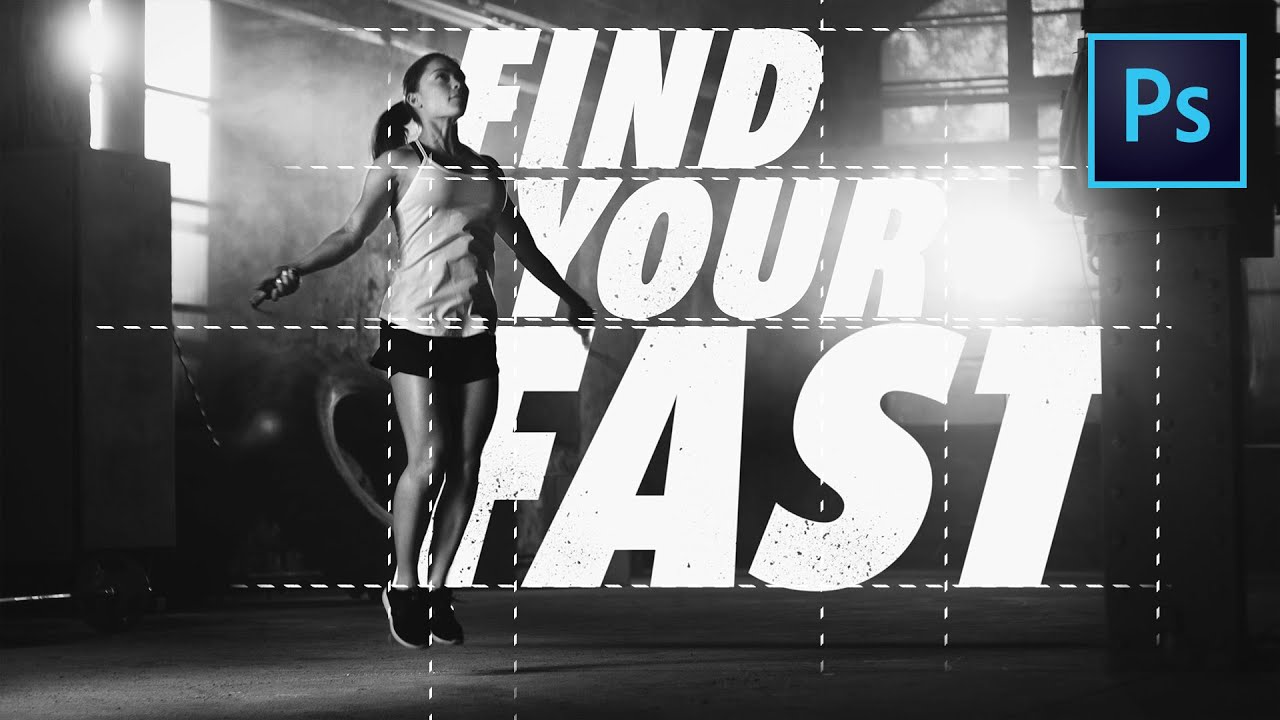
In this Photoshop tutorial, we’ll learn to create a floating text effect much like a series of Nike/Chicago Marathon posters from a few years ago. We will learn to blend text into a photo so it almost looks like it should be there by using shadows and masks and grain to help pull the scene together.
🧠 This tutorial was inspired by: https://i.pinimg.com/564x/54/ac/8f/54ac8fbfd88f6dbb74eba6f9f96fe7f9.jpg
━━━━━━━━━━━━━━
📝RECORDING NOTES → http://bit.ly/tutvid935
📸INSTAGRAM → http://instagram.com/tutvid
🎮DISCORD → http://discord.me/tutvid
📘FACEBOOK → https://www.facebook.com/tutvid
📱TWITTER → http://twitter.com/tutvid
🎓BUY MY PHOTOSHOP COURSE → http://bit.ly/28NuwFy
━━━━━━━━━━━━━━
MORE Advanced Photoshop Videos → http://bit.ly/tutvidFEATPlaylist
MORE List Photoshop Tutorials → http://bit.ly/tutvidLISTPlaylist
MORE Simple Photoshop Tutorials → http://bit.ly/tutvidPSPlaylist
MORE Video Editing Tutorials → http://bit.ly/tutvidPREMPlaylist
MORE After Effects Tutorials → http://bit.ly/tutvidAEPlaylist
MORE Illustrator Tutorials → http://bit.ly/tutvidAIPlaylist
MORE Lightroom Tutorials → http://bit.ly/tutvidLIGHTPlaylist
━━━━━━━━━━━━━━
tutvid is a YouTube channel dedicated to creating the best Adobe Photoshop, Premiere Pro, Lightroom, and Illustrator tutorials.
📫BUSINESS INQUIRIES → nate@tutvid.com
