CFL (Canadian Football League) Logo Reaction – Part 2 | RedBlacks, Alouettes, Stampeders & Lions
We’re back with Part Two of our Canadian Football League logo reactions, continuing the breakdown of CFL branding from a graphic design perspective. This time, Spencer steps in for Kyler, joining Thain and Matt to react, debate, and roast some of the league’s most recognizable logos.
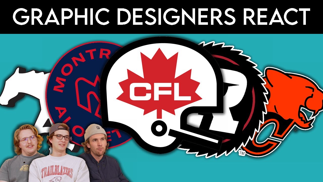
In this episode, we react to the branding and logos of the:
-Ottawa RedBlacks
-Montreal Alouettes
-Calgary Stampeders
-BC Lions
🔥 From bold color choices to classic mascots and typography, the crew gives their first reactions and design critiques on what works, what feels dated, and which CFL brands truly stand out. Expect honest takes, design insight, and plenty of banter along the way.
👕 At Geezy Tees, we live and breathe sports branding, logos, and apparel, and the CFL brings a unique mix of tradition and modern design that makes for great discussion. Whether you’re a CFL fan or just love logo breakdowns, this one’s for you.
👇 Which CFL logo do you think is the strongest? Who needs a redesign? Drop your rankings in the comments!
Follow us on Instagram: instagram.com/geezytees
Subscribe for more CFL logo reactions, sports branding breakdowns, and design hot takes!
#cfl #CFLLogos #canadianfootball #logoreaction #sportsbranding #graphicdesign #OttawaRedBlacks #montrealalouettes #calgarystampeders #bclions #GeezyTees