#ruleofthirds #graphicdesign #designprinciples #compositiontips #layoutdesign #designforbeginners #brandingdesign #posterdesign #layouttips #creativedesign #learnwithme #ytshorts
🎯 What Exactly Is the Rule of Thirds in Graphic Design? | Explained Simply
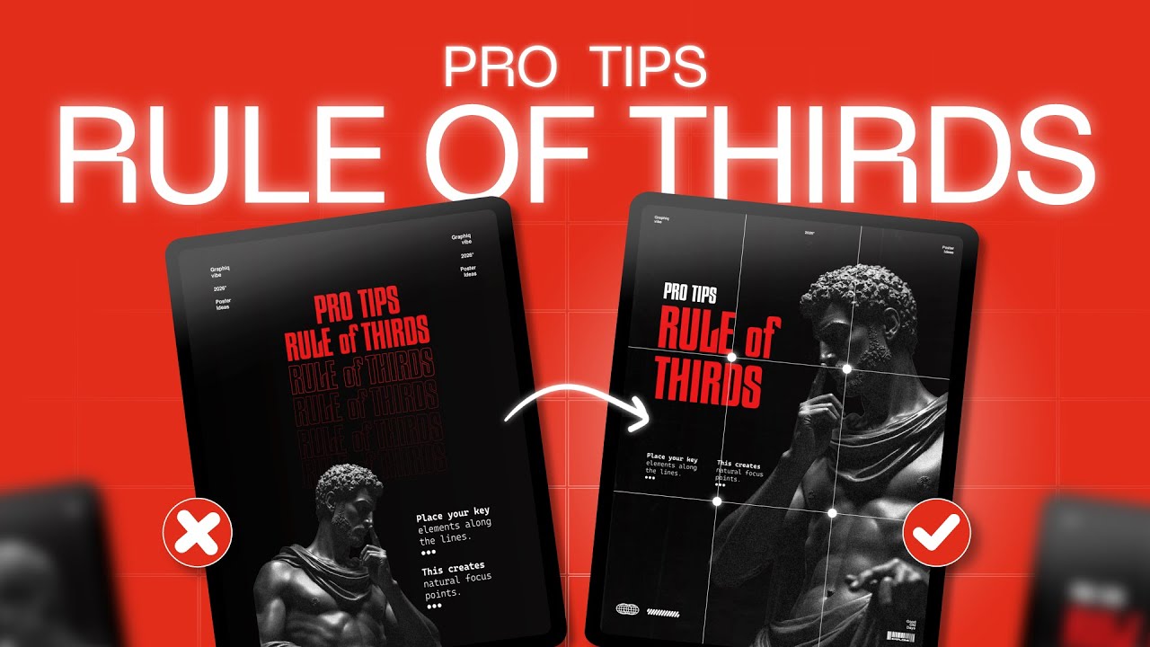
The Rule of Thirds is one of the most powerful and timeless composition techniques in graphic design — and in today’s video, you’ll finally understand what it is, why it matters, and how to use it to create better layouts.
Whether you’re a beginner designer or already working with layouts, posters, ads, thumbnails, UI/UX, or brand design — mastering this concept will instantly improve your visual balance and hierarchy.
Here’s what you’ll learn 👇
00:0 INTRO
00:31 What is Rule Of Thirds
02:26 How we can use it in our Layouts
05:33 Live Design Tutorial
🔍 In this video, you’ll learn:
✔️ What the Rule of Thirds actually means
✔️ How it improves composition and structure
✔️ How to apply it in posters, ads, thumbnails, and layouts
✔️ Tips to create balance and focus using grids
✔️ Mistakes designers make when using Rule of Thirds
✔️ How to break the rule creatively
Pro Tips for Perfect Composition | Make Every Design Stand Outhttps://youtu.be/iryl0HRLlO4
🧩 Why it matters
Design isn’t just about adding text and images — it’s about guiding the viewer’s eye, creating balance, and making visuals feel intentional.
The Rule of Thirds helps you create designs that look clean, professional, and engaging.
rule of thirds graphic design
rule of thirds explained
composition in graphic design
layout design tips
how to design better posters
graphic design tutorial beginner
design principles
visual hierarchy tips
how to improve graphic design