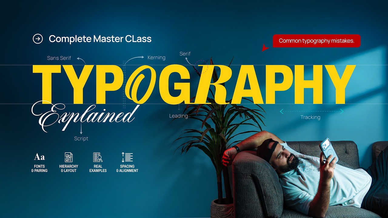
Typography is much more than choosing a good-looking font.
In this complete Typography Masterclass for Graphic Designers, I break down everything you need to know to use typography professionally — from font selection and type categories to hierarchy, font pairing, kerning, tracking, leading, alignment, contrast, spacing, readability and common typography mistakes.
In this video, you’ll learn:
• What typography actually is
• Font vs Typeface
• Different type categories
• Font personality and how to choose fonts
• Creating strong typographic hierarchy
• The 3-level hierarchy rule
• Font pairing techniques
• How many fonts you actually need
• Kerning vs Tracking
• Leading and line length
• Typography alignment
• Contrast and white space
• All Caps vs Sentence Case
• Choosing fonts based on purpose
• Designing with real content
• Common typography mistakes
• A complete typography checklist
The goal isn’t to memorize hundreds of fonts.
It’s to understand **what works, why it works, and how typography can communicate your idea better.**
If you’re a graphic designer, student, beginner or someone who wants to improve their design skills, this masterclass is for you.
And if you want to learn Color Theory from scratch, check out my previous video where I explain Color Theory in detail.
Comment below and tell me **what you want me to teach next** 👇
If you found this video helpful, don’t forget to Like, Subscribe and share it with another designer.
#Typography #TypographyMasterclass #GraphicDesign #GraphicDesignTutorial #TypographyTutorial #DesignTips #GraphicDesignTips #Fonts #TypeDesign #DesignEducation