How do you wireframe a website? How do you create a landing page from scratch? How do you sketch a wireframe? How do you design a sales landing page for downloadable products? How do you do UX design without going overboard? What is paper prototyping?
You can call it a squeeze page, a landing page, or a download page. This is the page that converts a cold audience into known users. And the web design needs to be on point in order to make these conversions! Enter: UX Design!
Our landing pages currently… let’s say they’re not so great. So over the next couple of weeks on The Futur Academy Channel, Mr. Ben Burns is going to share his process for redesigning the landing pages on thefutur.com.
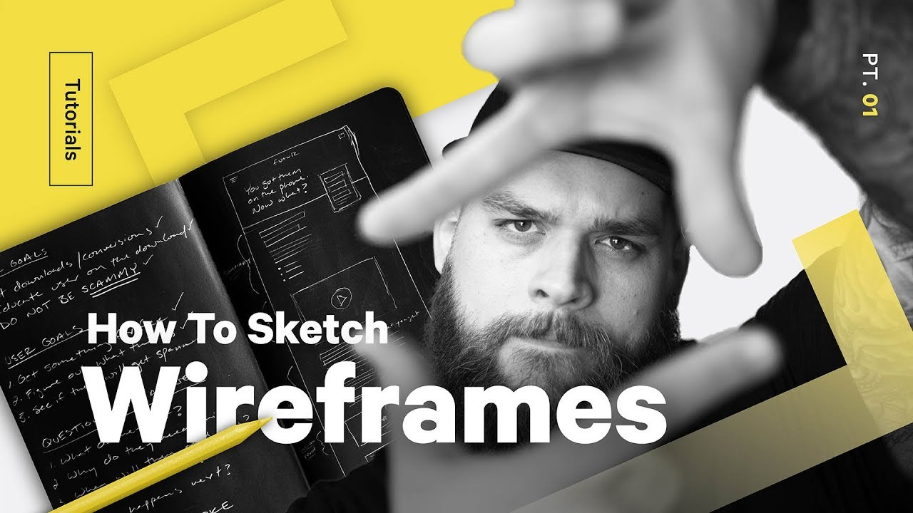
In this UX design tutorial, he shares his easy UX design process on how he thinks about the user experience, and what it might take to capture a potential user.
Here’s Ben’s outline:
—————-
Before drawing anything I figure a few things out. I write a simple list on one side of the paper that I can refer back to. And I always look at four distinct prompts:
1. Our goals
2. User Goals
3. Questions to answer
4. Emotions to invoke
I jot down three or four bullet points for each. This doesn’t have to be fancy, especially if this is our first pass at the page. The first pass is always going to be an educated guess. As people interact with the page, we can always improve it. Back to the sketch.
Once I have everything mapped out, I start sketching out a basic wireframe. What comes first should always the overlapping goals of the site owners and the users.
In this case, that intersecting goal is to download something for free. So I want to prioritize the download action, which in the case is the form that you submit when you download this resource.
I also want to make sure there’s an easy-to-read summary for those of you who don’t actually like to read stuff. I know you’re out there.
Once that first goal is accomplished, I start filling in content that will handle secondary goals. In our case, we want to educate users on what the download is, and answer all of the user’s potential questions.
It’s also helpful to keep in mind what kind of assets you have at your disposal. I know, for example, that we just shot a trailer for this download, so I want to make sure I’m including space for that video.
There are a few common symbols that I use during wireframing. Big headers are usually written out if I can brainstorm a catchy title. Narrow boxes are smaller headers. Text is usually groups of lines. Videos are represented with little play icons in boxes. Images are usually a box with an X in it. Buttons are squares with text in them. You guys get the idea. You can kinda see the website come together as I sketch.
Once I’ve got all the content mapped out on the page, I go back and make sure that all of the goals and questions have been answered. I literally start checking things off and labeling these sections.
Get more of Ben:
@mrbenburns
http://www.mrbenburns.com/
#uxdesign #webdesign #UX #UI #Wireframe
===
👉Subscribe: https://goo.gl/vB9zoP
👉See our main channel: https://goo.gl/F2AEbk
Want a deeper dive? Typography, Lettering, Sales & Marketing, Social Media and The Business of Design courses available here:
https://goo.gl/bRt5qd
If you’re a complete beginner, consider taking any of these Adobe Creative Cloud fundamental courses from our friends at Bring Your Own Laptop: http://byol.me/thefutur
—
Love the content? Become a sustaining member for $5/mo today.
https://goo.gl/nwekfL
Our recommended products and Booklist:
https://kit.com/TheFuturIsHere
Kits & Proposals:
https://goo.gl/mSjuWQ
Visit our website:
https://www.thefutur.com
FREE resources:
https://goo.gl/Qh6gHr
Mandarin (Chinese) Subtitles on UiiUii
https://uiiiuiii.com/?s=the+futur
—
OUR AFFILIATE LINKS
Webflow: http://bit.ly/2EbET9l
Retro Supply Co.: http://bit.ly/2GW8gzR
Skillshare: https://goo.gl/YCo2uT
Amazon: http://bit.ly/thefuturishere
Creative Market: https://goo.gl/g4jlTE
Design Cuts: http://bit.ly/2GSsAR3
By making a purchase through any of our affiliate links, we receive a very small commission at no extra cost to you. This helps us on our mission to provide quality education to you. Thank you.
—
Futur Podcast on iTunes: 🎙
https://itunes.apple.com/us/podcast/the-futur/id1209219220?mt=2
Spotify: 🎙
—
We love getting your letters. Send it here:
The Futur
c/o Chris Do
1702 Olympic Blvd.
Santa Monica, CA 90404
USA
—
Host– Ben Burns
Content Director– Matthew Encina
Cinematographers– Mark Contreras, Stewart Schuster, Aaron Szekely, Ricky Lucas, Jona Garcia
Editors– Mark Contreras, Stewart Schuster, Aaron Szekely, Ricky Lucas, Jona Garcia
Live Editor– Jona Garcia
Social Team– Elle Money, Alex Burlui
Futur Theme Music – Adam Sanborne http://www.adamsanborne.com
Typefaces: Futura, DIN, Helvetica Neue, Calibre
Futur theme song— Adam Sanborne
