https://youtube.com/watch?v=6AvcV8Fa8JE
🏀 https://dribbble.com/adrianshp
Find me on:
⚡️ https://instagram.com/shpadrian
⚡️ https://twitter.com/shpadrian
⚡️ https://dribbble.com/adrianshp
🎵Music from: https://theartistunion.com/joakimkarud
1. Flat design is going material
In design industry we will se more people going with from flat to material design and I’m not referring only to front end components which by the way I’m not the biggest fan of. I’m talking about illustrations, icons and all that beautiful stuff that dibble loves so much so dribble.
If we take a look at this new material style — and BTW please correct me if I’m wrong and this is not called material, I’ve looked all over the web and I think this is part of the material ecosystem:
* Textures and shadow will again give the design depth,
* Colours and gradients play a big part, we’ll see more light colours in weird combinations
* Using animations with this style will be more common than ever before
I think google wants to standardise the design industry with material to have like a default style and ux for the web and mobile platforms. I’m not saying that this is a bad thing but because material is so hard to implement correctly (the design system has tons of documentation and if the designer is not well informed the outcome is not a pretty sight) so that’s why I subjectively don’t like material design in general. But if you a meticulous designer and you take your job seriously there’s no doubt that it’s going to look and work awesome.
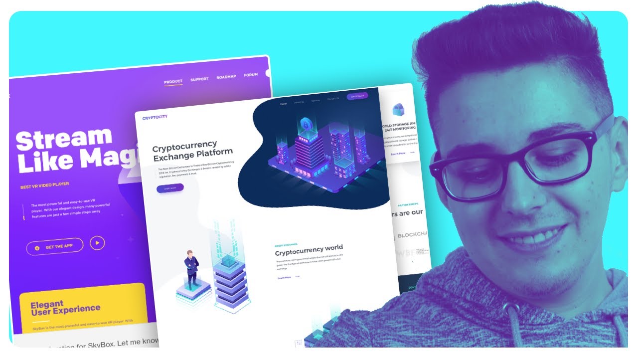
2. Isometric or 3d style
Next up we have one of my favourite trends for this coming year and it’s called isometric or some people just call it 3d style.
If you are someone who’s been in the design game for a long time you probably have seen the new concepts of illustrations or even used them, I personally did in one project which by the way I’m giving if for free if you’d like to download it, the link is down below. I think this style could be used mostly in technology niches especially for digital products like cryptocurrency platforms, which gives a futuristic and modern look. I’ve seen a lot of these illustrations taking over dribble and modern tools are getting on this ship as well
3. Overlapping effect
This technique is typical for the mobile applications design and has been around for awhile. A variety of elements can overlap each other. This can be fonts, colors, images. The practice of using this effect has some strong points
• The interface becomes more interesting and eye-catching; • A sense of space and depth is created that increases the comfort of using the app
• If the same elements overlap, it looks unusual, despite the fact that such a design solution is not new
4. On the UX side we have The rise of Voice Triggering apps
So you probably figured out voice triggering apps or devices like Alexa will be part of our daily routines whether we like it or not, because Amazon is investing a lot of resources in this technology so the chances are that it’s going to happen. If you need more proof, why do you think Adobe has just released the first voice prototype feature in Adobe XD
So if you want to catch the next big train on a fresh market, and I’m talking to you UX Designers, you might want to jump into this one and add Voice UX Designer to your CV.
5. More emphasis on content and typography
For me, the most, and I mean the most important stuff for a app or website is typography, I always tell people who want to get into design to first learn typography more than colours and visuals just because 80% of a website or app is basically text.
Well this is not really big news but designers are moving towards having a clear order with how visuals are presented to make content digestion easier, that means removing unnecessary “design clutter” to keep the attention focused on product content
So to show you what I mean by that here is a email that I got from Spotify and clearly they have been embracing this new technique. If you see they minimised the text amount to absolute minimum of necessity and kept the graphics really minimalistic with their branding colour. I know this is an email and has to be really lightweight for spamming reasons and such but it’s still a viable example.
I think these trends will evolve or be replaced with new innovations even further. And that’s the fun of UX design — it’s constantly changing and presenting different, exciting challenges that push our creativity and ultimately make us better designers.
So that’s it for todays video, I’m Adrian Stefan I hope you learned something new today, please consider subscribing if you haven’t already. Please do let know you which one is your favourite, I’m the most into isometric style, or maybe add new ones that you think will grow even more and yea, thank you for watching, Adrian signing out.