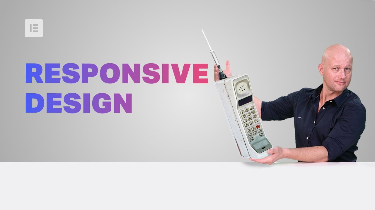
In this tutorial, we examine several responsive web design challenges and explore various ways to solve them elegantly using Elementor.
Tip #1. Responsive Design Begins and Ends With Correct Planning.
In this business, no one in their right mind would set off on a project without a plan, a draft or sketch. The more forethought and planning you can invest in the design process, the better you will be able to anticipate the technical problems and adjust your ideas accordingly.
Tip #2. Positioning Elements for Mobile Responsive View
When it comes to correctly positioning sections for mobile responsive view, we suggest avoiding setting values in pixels. Setting values in percent (%) or in EM keeps them relative to the overall screen size. Thanks to the responsive mode, we were able to conclude that we should set the padding to 17% either side of the text widget, in our next example, so that we get similar positioning in both desktop and mobile view.
Tip #3. Responsive Design: A Horizontal Approach
Traditionally, web design is a vertical process, which is why many designers prefer to complete the design of the entire page for a single device before, trying to make the same design work as well on the next device. An easier way to go about this is to design our views horizontally, one section at a time, across all our devices as we go along.
Once we have made sure that section looking the way we want it to in Desktop, Tablet, and Mobile views, we can move on to the next. Where possible, duplicate sections, columns or widgets, and update the relevant content; re-use them as foundations to build the other similar elements on the page.
Tip #4. Change / Position Background Image
Certain background images, like that of the example below, may look great in the desktop view. However, it doesn’t take much experience to see how it wouldn’t work well when viewing the site on a mobile screen.
Tip #5. Create Alternative Section
As promised, we are only too happy to share our experience and insight with our community, who will no doubt be familiar with our next example. Well within the top area of our home page, we needed to come up with a solution to the 3-column text section. Rather than having this appear as 3 boring rows of text in Mobile view, we decided to create an alternative section, with the text inside a slider widget.
Read the full post: https://elementor.com/blog/responsive-web-design/
Get Elementor: https://elementor.com
Get Elementor Pro: https://elementor.com/pro/
