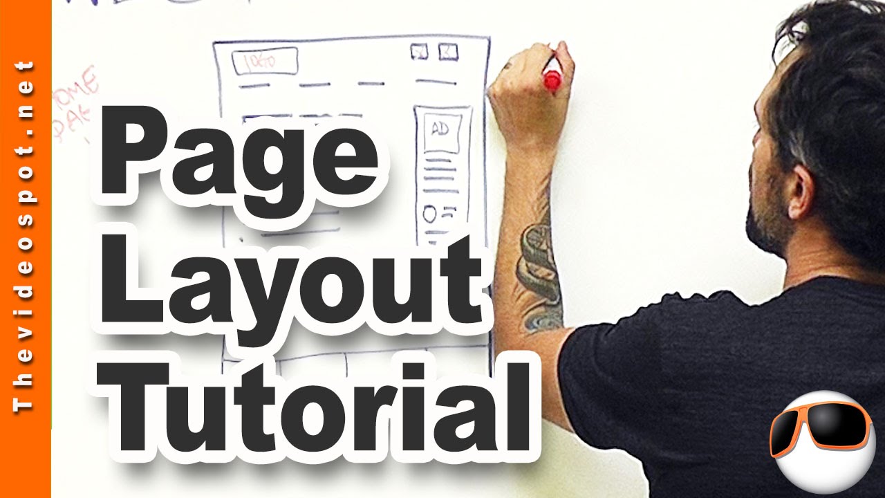
Get my blueprint cheat sheet here http://bit.ly/webblueprints. In this video I’ll cover the main assets to a web page including page navigation, banners, sidebar design, footer, and body page specs. I’ll include things like word count, keyword saturation, video placement, and outbound links as well as links to other videos on similar topics. Don’t forget to share this video with your friends who are struggling with website design!
For every subscriber, YouTube pays me a piece of chicken and a can of beans so PLEASE Subscribe to my channel: http://bit.ly/XkdbXS
—————————
Video Notes:
************************1. Create templates************************
Now a, a big problem that I see with business owners and like clients that hire me and, and other WordPress web designers is for every page, they’re designing like, a new page. You know, it’s like well, we need to add a new page to our website. It’s like, oh great, I gotta design a whole nother page.
Now it doesn’t work that way, you need to be creating templates and a lot of website, website themes today support a template based system. So what we do is we create a series of templates that you can now export to the rest of your pages. But it’s still important that those templates.
************************2. Top level Navigation************************
First of all, and of course, you know, like you’re, you’re always, this could be your social media links up here. This could be like your phone number, or an email button.
You know, having those, always able to contact me, buttons, I think is a good idea. Up here you’ve got your navigation tabs. Now, when I first started in this, it was kind of like the thinking that you should have seven navigation tabs. I don’t agree with that anymore.
I think that you need to have like four or five, tops, and they need to be very simple. Every single one of them should be directed at converting a viewer to sale. So you don’t need one of these navigation tabs to say home. Right? Cuz typically your logo will lead you home.
You, you need it to say something like, About Us. What we offer. How to work with us. And our blog. Something like that.
WordPress web design tutorial
Designing a top level web page template
************************3. Sidebar and Footer************************
I believe in side bars. Some people are doing like this whole page design, that’s okay. That’s fine. If that’s the, the intent of your site. I like side bars because it enable me to, to engage with the viewer in different ways.
Use related pages for your web design- It might be helpful to have YouTube. You know, YouTube marketing. Landing page videos. Video production. Video bumpers. You know? Maybe even a tag that says, what are you looking for? And then underneath that I have a little circle there. Which I typically use to represent a testimonial. So maybe you’ve got.
A WordPress testimonial widget right in there, where it’s, every time it’s refreshed, a new testimonial pops up, right. So you’re engaging with the viewer that way. You might even have like social media links on, experimenting with an Instagram box. We’ll see how that turns out. Let’s go to your, I’ll come up to the main page last, go to your footer.
Your footer here is a huge resource. I like to have a three or four box footer that maybe has, like, you know, a summary about us, maybe our social links and then, maybe, like, a schedule, like schedule with me, or a work with me, right. And this could be an image.
Maybe it looks like a contact box, but it’s an image, and when you click it. It will go back to that work with us page, see. And then maybe in here you’ve got something you like your blog roll. Right? So your, your latest and greatest blogs. Or maybe it’s like your most popular blogs which you know, you can, you can work that out with some plug ins.
************************4: Main Page************************
In your main page or top level design page, your main body, let’s go back to that. Okay, we said about 400 words. But look at how I have it structured. I have an image up at the top and then I have some text right next to it. Now underneath that I have more text.
Underneath that I have some bullet points. So basically what you have here is you’ve got, you know, everything you really need to convert that viewer. Right up here, right up there. And then you’re gonna say something like let’s dig into that a little bit more because you don’t want them necessarily moving off of your page, right?
—————————
For more information:
WEB: http://thevideospot.net
TW: http://www.twitter.com/owenhemsath
FB: http://www.fb.com/yourvideospot
