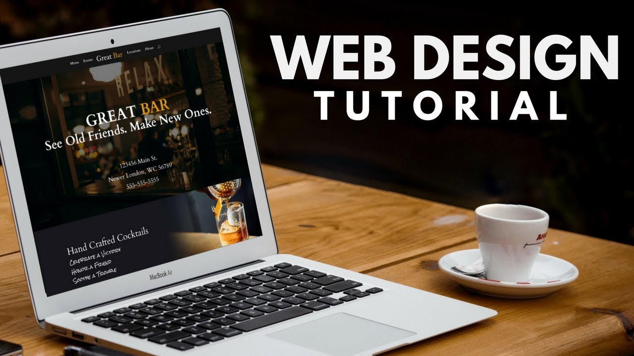
In this web design tutorial we’re going to learn how to build a WordPress website for a bar or restaurant. Check out the Divi Theme here: https://www.realwebsitehints.com/get/divi-bar-design/
Tools used in this tutorial:
Divi theme (affiliate link):
http://www.elegantthemes.com/affiliates/idevaffiliate.php?id=26271&url=35961&tid1=yt&tid2=bar&tid3=standard
Web Images From Unsplash:
https://unsplash.com/collections/1295763/great-bar
CSS angle tool clippy:
https://bennettfeely.com/clippy/
Setting up the google maps api key:
Creating website hero area: 2:00
Solid background fade to an image: 10:00
Side by side slash or angle between columns: 14:20
Making your website work on mobile: 22:33
Separating your content from the background 27:27
Setting up the Map module: 32:05
Read the instructions and hints for this tutorial on my website:
https://www.realwebsitehints.com/web-design-tutorial-how-to-make-a-small-business-website-homepage-bar-or-restaurant-example/
How to configure the Divi theme: https://youtu.be/i0gMJX-jElU
One of the most important things when designing your website is the first impression that your website makes on the visitor. The first section of your website sometimes called a hero area should quickly and simply communicate what your website is about. I walk thru exactly how to create an effective website hero area at 2:00
Part of web design is incorporating the tools that you have as part of the website builder with the clever use of images that you upload to your website. In this tutorial we look at creating a section that looks like it fades from a solid background color to an image. See how this was created 10:00
You can make your website stand out by incorporating design techniques that you don’t find on all websites. In this tutorial I look at creating a slash or angled transition effect between two columns check it out at 14:20
Divi allows you to make a responsive website however sometimes the web design that you create may not work well on mobile devices. Divi allows you to enable and disable sections rows and modules based on devices. In this video I show you how to setup a section of your website so that it looks good on both mobile and desktop. Check out the video at 22:33
Adding texture to the design of your website is important. Texture can make a bland design more interesting. One of the problems with adding an image that has a lot of texture or is very busy is that it can make it difficult to read or see the content that you add to your website. One way around this is by adding a solid background color behind your content. The Divi theme makes this really easy 27:27
If you are creating a website for a small business or a local business you probably want people to be able to find you! With the Divi theme you can easily add a map module anywhere on your website. The initial setup is a little bit difficult because you will need a Google API Key you can learn how to create a google api key using the link above. Then see how to add a map section to your website 32:05
