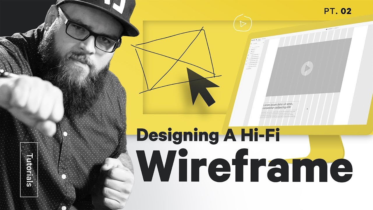
How do you use Adobe XD to wireframe? What is a high-fidelity (hi-fi) wireframe? How do you design a webpage wireframe? How do you use layout grid in Adobe XD? What is your user experience or user interface design process?
Our own Ben Burns (https://www.instagram.com/mrbenburns) shows you how. Here’s the show notes:
Step One: Set up your workspace – 01:47
Open up Adobe XD (I don’t like wireframing apps like Balsamiq) to start wireframing from scratch. Build and use a layout grid: I like a 12-column grid with a max width of 1440 pixels.
Once your artboards and grids are set up, take a photo of your sketch, upload it, and plop it on an extra artboard. That way you can reference it easily and often.
Step Two – Block out your sketch – 02:51
Don’t make too many changes just yet. Get a digital version of the sketch as you drew it. That way you’ll have all of the components on the artboard to move around later.
Use shades of a single color like grey or blue to keep things simple, and use the same symbols for images and videos that you sketched.
Indicate what content belongs where using your headers. Estimate body copy length using placeholder text. I use an XD plugin called Lorem Ipsum by Pablo Klaschka that makes this really really easy: hit Command + Option + L and click the button. BAM Lorem Ipsum filler text.
Once you’re done, duplicate your artboard.
Step Three – Bring in actual copy – 03:27
You want to work with the actual copy, even if it’s the first draft. What so many people don’t realize is that writing makes up a significant portion of positive user experience.
Trying to move into visual design before having copy is an uphill battle. I like to think of UX design as a ping pong match between a writer and a designer. So much of the visuals we create really depend on the copy that explains things.
Working with the actual copy will help us avoid mistakes like not planning for really long headers or filling space with placeholder text that isn’t really necessary.
Step Four – Quality check – 04:36
Before this point, we haven’t really changed much about our original sketch. Now it’s time to start making tweaks. Ask yourself questions like:
1. Are there too few or too many visuals?
I realized that the user wouldn’t actually see a visual of the download until way too far down the page, so I switch some things around to get that visual right up top
2. Does the copy reveal any missed opportunities?
I planned for the last call to action, that last button at the bottom of the page, to scroll back up to the form at the top of the page. But reading the heading text made me realize that a second form would probably be more effective, as it would shorten the user journey by a click.
3. Does the page “flow” for the user?
Sometimes it takes a little context to see content that’s out of order. The what’s inside section seemed out of place after I put the why section copy in.
4. Can the basic composition be improved?
Using the grid in a new way really made the composition so much more interesting.
===
👉Subscribe: https://goo.gl/vB9zoP
👉See our main channel: https://goo.gl/F2AEbk
#TheFutur #UX
Want a deeper dive? Typography, Lettering, Sales & Marketing, Social Media and The Business of Design courses available here:
https://goo.gl/bRt5qd
If you’re a complete beginner, consider taking any of these Adobe Creative Cloud fundamental courses from our friends at Bring Your Own Laptop: http://byol.me/thefutur
—
Love the content? Become a sustaining member for $5/mo today.
https://goo.gl/nwekfL
Our recommended products and Booklist:
https://kit.com/TheFuturIsHere
Kits & Proposals:
https://goo.gl/mSjuWQ
Visit our website:
https://www.thefutur.com
FREE resources:
https://goo.gl/Qh6gHr
—
OUR AFFILIATE LINKS
Webflow: http://bit.ly/2EbET9l
Retro Supply Co.: http://bit.ly/2GW8gzR
Skillshare: https://goo.gl/YCo2uT
Amazon: http://bit.ly/thefuturishere
Creative Market: https://goo.gl/g4jlTE
Design Cuts: http://bit.ly/2GSsAR3
By making a purchase through any of our affiliate links, we receive a very small commission at no extra cost to you. This helps us on our mission to provide quality education to you. Thank you.
—
Futur Podcast on iTunes: 🎙
https://itunes.apple.com/us/podcast/the-futur/id1209219220?mt=2
Spotify: 🎙
—
We love getting your letters. Send it here:
The Futur
c/o Chris Do
1702 Olympic Blvd.
Santa Monica, CA 90404
USA
—
Host– Chris Do
Content Director– Matthew Encina
Cinematographers– Mark Contreras, Stewart Schuster, Aaron Szekely, Ricky Lucas, Jona Garcia
Editors– Mark Contreras, Stewart Schuster, Aaron Szekely, Ricky Lucas, Jona Garcia
Live Editor– Jona Garcia
Social Team– Elle Money, Alex Burlui
Futur Theme Music – Adam Sanborne http://www.adamsanborne.com
Typefaces: Futura, DIN, Helvetica Neue, Calibre
Futur theme song— Adam Sanborne
