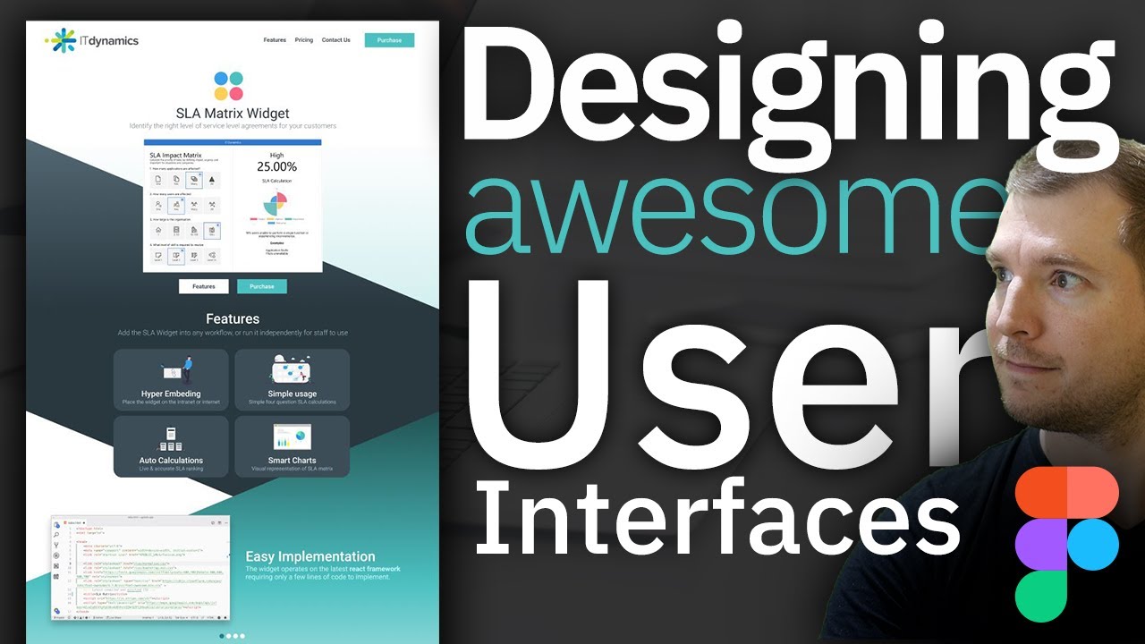
Figma Web Design Tutorial for creating UI
In this video, I use Figma to design a website user interface. We take a look at creating the logo, using different colours and why I pick those colours. I cover the reasoning behind why the user interface looks a certain way, such as the design of fonts in the UI, and why I pick certain sizing and shades. We create a features section that we position to be clear, and I show you what sort of wording and images I attach to ensure they accurately depict the text they represent, as well as the colour and font design that I use to make those sections stand out. I look at background UI colours to ensure each section of the website design looks separate and distinct, as well as how I put in to make the sections flow into each other to keep the UI feeling comfortable and succinct.
Using design thinking and UI interfaces can be challenging, but hopefully, this video shows you how a website is built using programs like Figma from just a few basic ideas.
You can use Figma here: https://www.figma.com/
#figma #tutorial #ui #ux #uiux #design
