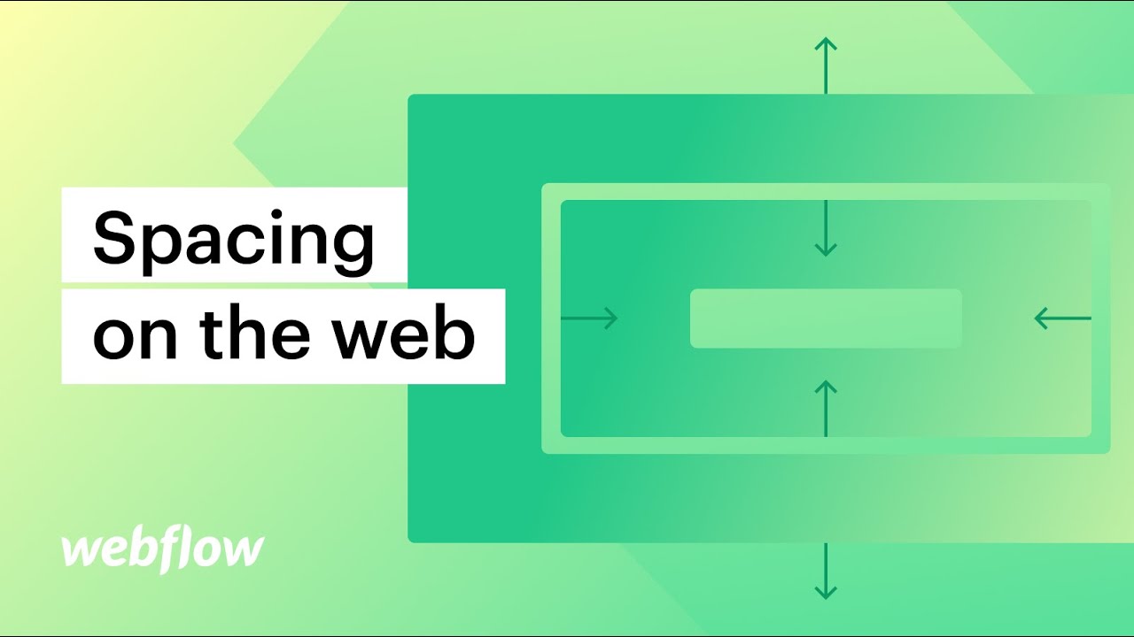
Learn the ins and outs of padding and margin to set spacing on web elements. We’ll use practical design examples to demonstrate how to add space inside and outside of cards, images, headings, buttons, and Occam’s square.
00:00 – Introduction
00:44 – Padding & margin on one side
01:43 – Padding & margin on both sides
02:17 – Padding & margin on all sides
02:26 – Auto margin & centering
04:03 – Negative margin & overlapping
04:30 – Use cases & Occam’s square
———-
Get started with Webflow: https://wfl.io/2r7cVUW
https://webflow.com
Tweets by webflow
https://facebook.com/webflow
