Web Design UI Tutorial
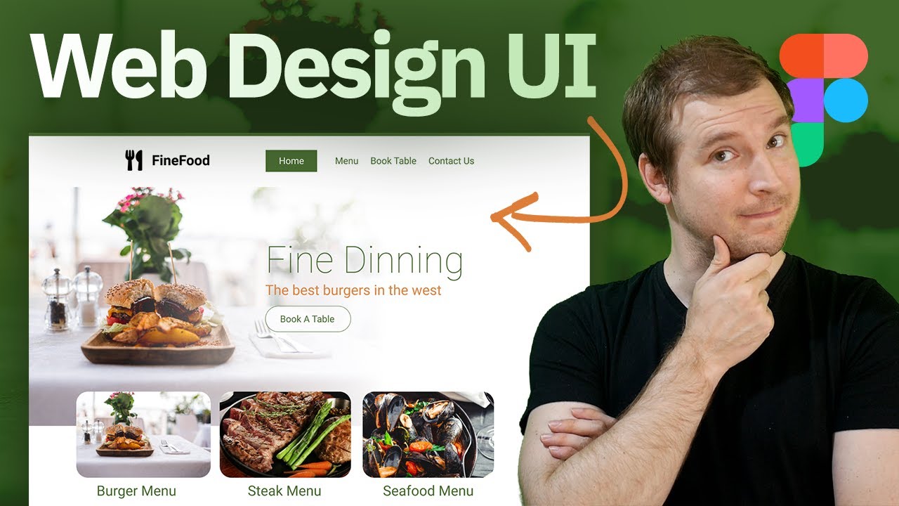
When you doing a website design ui, it’s important to take a number of things into consideration. In this video, I use figma to create a dinning design web ui tutorial. We go over how to select a good web ui image to use for the site, as well as the process of creating the ui.
It’s important to follow grid structures when creating a web ui as well. We create a 12 column design which is similar to what you see in bootstrap, and use this for the rest of the ui components as part of this design.
00:00 – Introduction
00:19 – Figma Canvas
01:40 – Web ui banner design
03:50 – Design ui hero text
06:55 – Web UI Menu and Navigation
09:55 – Website Design Call to Action
13:52 – Conclusion
This video is an introduction to more design for developers. Learning how to create different web ui’s from scratch and what kind of design thinking goes into creating things like this. If you enjoy this kind of web ui design content, please let me know in the comments, as well as any suggestions on topics you might want me to cover.
If you want to see the full design, you can check out the figma file here:
https://www.figma.com/file/8rgDnV4IplSd2elNDzAjwH/Web-Design-UI-Tutorial?node-id=0%3A1
#web #design #ui
Follow and support me:
🐦 Twitter: https://twitter.com/adrian_twarog
💬 Discord: https://discord.gg/nGdThpE
💸 Patreon: https://www.patreon.com/adriantwarog
🖥️ Dev.to: https://dev.to/adriantwarog
