https://youtube.com/watch?v=ROnclCjTye4
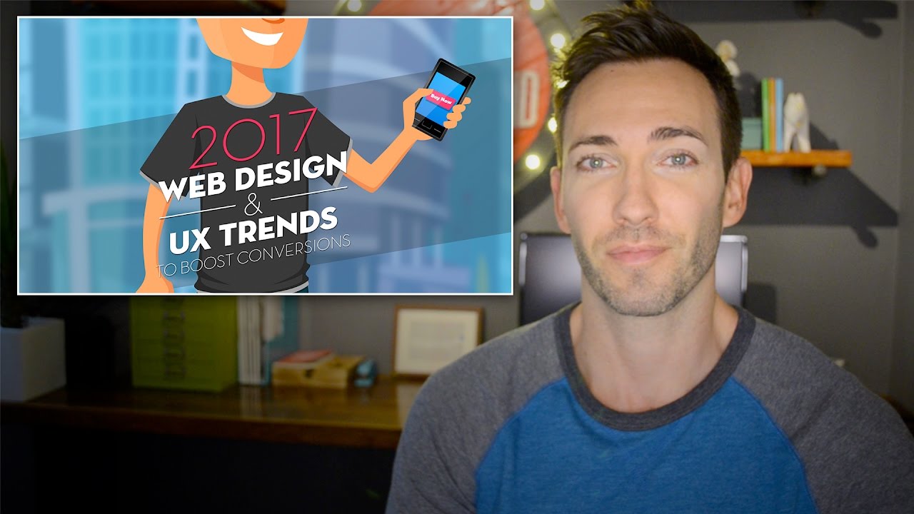
Web design trend reports are fun and all, but what if they could help you increase conversions while keeping current? That is our aim for this list of ten top web design & UX trends for 2017.
Web design trend reports are fun and all, but what if they could help you increase conversions while keeping current? That is our aim for this list of ten top web design & UX trends for 2017.
This is based on an infographic we published, so if you’d like ot check that out and embed it on your own site, just grab the embed code here: http://thedeependdesign.com/2017-web-design-trends-infographic/
Whether you’re a web professional or in charge of your business’ website, this video breaks it down for you.
Here’s a list of what you can expect to learn:
2017 Web Design Trend #1: Age-Responsive Design
Since different age groups have different expectations in a website, we will see more sites offering up different experiences based on a user’s perceived age.
Trend #2: Skeleton Screens
This is an excellent way of making a site load feel much faster to your users, keeping the bounce rates nice and low.
Web Trend #3: Engagement Bots
Many businesses are starting to use chatbots in very interesting ways, automating many processes needed for healthy conversions.
Trend #4: Shopping Cart Marketing
By offering upsells, cross-sells and bundled offers during the checkout phase, you can increase revenue by as much as 30%
2017 Web Design Trend #5: Animated CTA Buttons
There are many ways to make a CTA button stand out, but we’re starting to see understated movement develop as a trend in 2017.
Trend #6: Cinemagraph Hero Images
Part video, part photo, cinemagraphs are a brilliant mind-trick to get users to take a second look.
Web Design Trend #7: Persuader Videos
By adding a video to your site which addresses all the major objections customers may have before buying, you can pave the way to more conversions.
Trend #8: Value-Based Exit Overlays
While popups are annoying, they just work. So by removing the most annoying part, and making a really compelling offer, you can save some sales that would have gone away otherwise.
2017 Web Design Trend #9: Death of the Homepage
If you take the emphasis off the homepage, and put it onto multiple landing pages, you can cater your messaging to different audiences, increasing conversions.
Web Trend #10: Scrolling Trumps Navigation
“Above the fold” isn’t what it used to be. By keeping more content on a single landing page, you can take customers on a well-planned journey leading to a conversion.
The Deep End
647 W Sheridan Rd #4b, Chicago, IL 60613
Phone:(773) 701-5282
