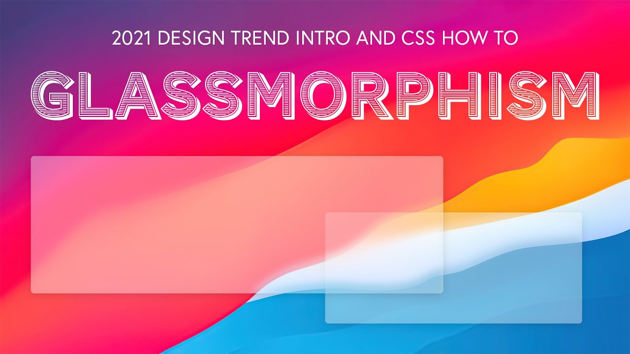
2021s big web design trend is Glassmorphism. Similar to what Apple has been doing for years with iOS and OS, but now brought to website design and cards. Glassmorphic design seeks to replicate the real world effects for “frosted glass”, isolating content in front from the background via blurs, transparencies, and simple drop shadows.
This video shows you how to make a card following the “rules” of #Glassmorphism, offers several examples, and discusses if it will be prominently featured in the “big sites” of 2021.
Where this design comes from: 0:50
Glassmorphic examples: 1:20
Creating a Glassmorphic card w/ 3 css properties: 4:50
Major issue with Firefox: 7:47
How it looks on Firefox: 10:10
Review: 10:41
Will We See This In Production?: 11:25
Review of the 3 steps in css to make Glassmorhpic cards: 12:20
Our write up: https://isotropic.co/a-look-at-glassmorphism-2021s-web-design-trend
Codepen CSS: https://codepen.io/Isotropic/pen/YzGRPqa
Another great read: https://uxdesign.cc/glassmorphism-in-user-interfaces-1f39bb1308c9
Read the blog at https://isotropic.co/blog
