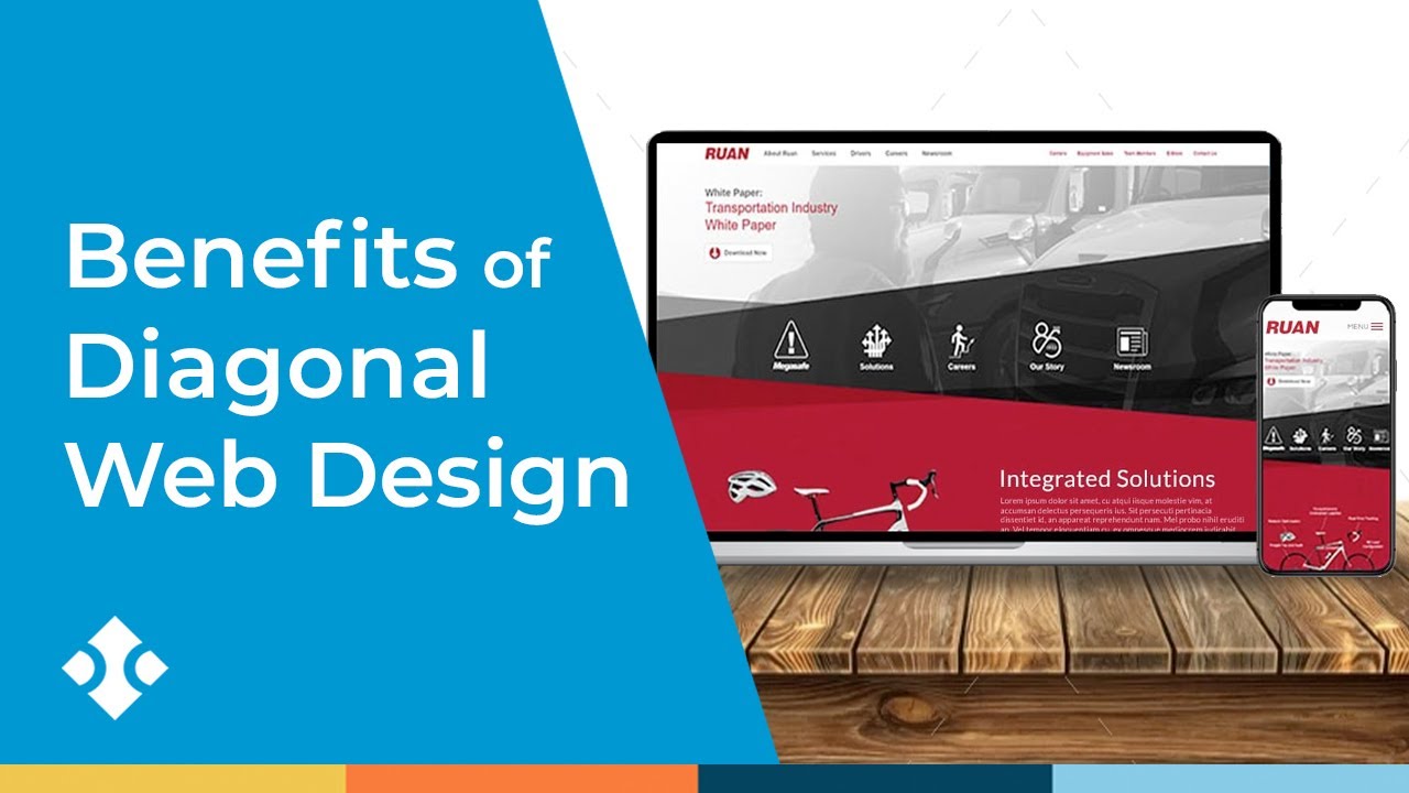
The pros and cons of an emerging trend: diagonal website design. Traditionally, websites feature straight, horizontal lines to separate sections, but the diagonal web design adds an interesting and unique flare to page layouts.
After conducting UX research a few years ago, our team discovered that using diagonal lines gives a clear and interesting path for the user’s eyes to follow down the page. If done well, the slanted appearance of diagonal design can naturally draw the eye down a page and keep the visitor scrolling.
Learn more about upcoming web design trends at https://www.bluecompass.com/blog/web-design-trends-to-watch-for
Check out our web design services at https://www.bluecompass.com/web-design-and-development
#webdesign #webdesigntrends
