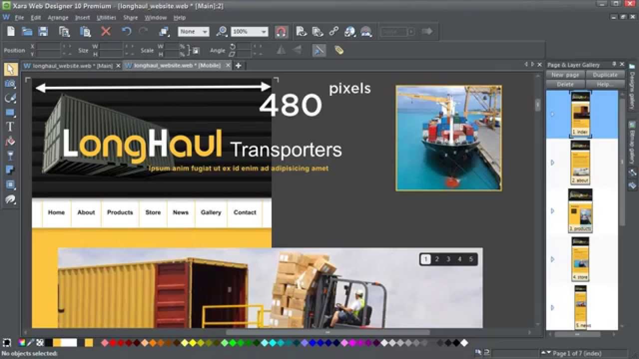
With the surge in popularity of browsing on mobiles and tablets it is becoming essential to create sites that are tailored to the needs of these visitors. Until now the solution has involved creating multiple sites and a good understanding of JavaScript. v10 introduces a Responsive Web Design (RWD) solution that allows you to create a single file containing variants of your site at different widths, so that you website responds dynamically to the screen size of the viewer, presenting the design most appropriate to their device. And as you’d expect from Xara you won’t need to do any coding whatsoever!
Part 2 – http://youtu.be/xlAU8_G10rQ
More info on the software: http://www.xara.com/
Join us on:
Facebook: https://www.facebook.com/XaraGroup
Twitter: https://twitter.com/XaraGroup
Google +: https://plus.google.com/+XaraGroup/posts
TalkGraphics forums: http://www.talkgraphics.com/