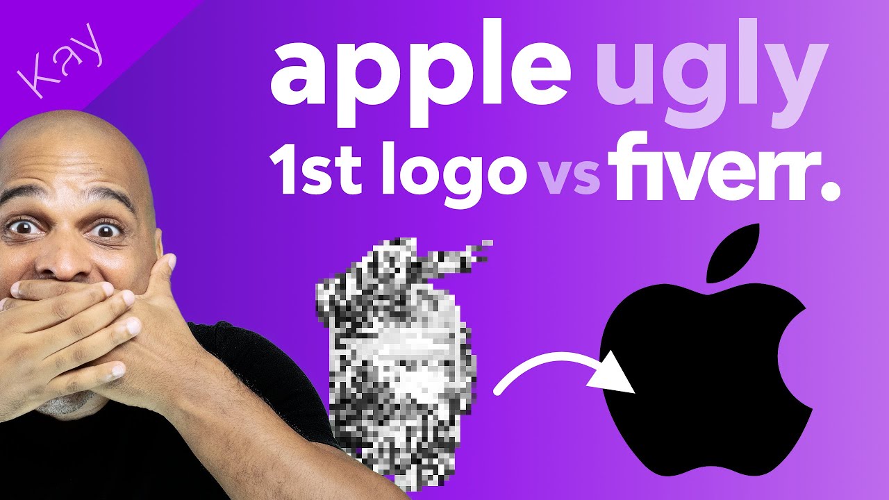
Apple First Logo (UGLY) vs Fiverr: in today’s video, I answer a question about using services like Fiverr to get the logo for your website and I compare it with Apple’s first UGLY logo.
Many people treat the logo of their business as something that can be done in 5 minutes, by their nephew Kevin. Sorry if your first name is Kevin but you get the point (no Kevin has been harmed in this video).
This is an example I often refer to with my clients, when their branding is not up to par with the image they want to convey.
If you’ve never seen Apple first logo, make sure you prepare yourself mentally because it hirts.
The good news is that you can always do better, and the best exampel is Apple’s current logo: iconic and beautiful!
TOOLS I LOVE:
– Elementor Pro (affiliate): https://kaycinho.com/elementorpro
– Astra Pro (affiliate): https://kaycinho.com/astra
– Crocoblock (affiliate): https://kaycinho.com/crocoblock
– Wirementor (my own tool): https://kaycinho.com/wirementor
MORE LINKS:
– Wirementor demo (built by me): https://kaycinho.com/wirementordemo
– A2 Hosting (affiliate): https://kaycinho.com/a2hosting
ONE PAGE WEBSITE FREE COURSE
GET MY HELP:
ALL MY RECOMMENDED RESOURCES:
https://kaycinho.com/resources/
DOWNLOAD MY FREE BRAND GUIDELINES TEMPLATE
https://kaycinho.com/brandingtemplate
DISCLAIMER: I often review / link to products & services that I love and think you may find of interest. When you purchase a product/service through one of my link, I receive a commission, which helps me producing free content (you don’t pay anything extra!).
Also, I am the creator of Wirementor.
#logodesign #design #apple
