Responsive Web Design and Adaptive Web Design
The Interweb “as we really know it” began as a small pond of ambitious servers in the 1990’s. Dial-up internet access was cumbersome, it took a lifetime just to load a web page. Now in the 21st century, the Interwebs have become a vast ocean of data. We can surf the seas at the speed of fiber optic light from the comfort of our own homes, or at our favorite fishing hole via smart phone technologies. The speed and bandwidth of today is amazing, and it is only gaining momentum.
We must be able to adapt to changes in browser technologies, as there are many new devices out there that must be supported. These new technologies do not just “surf” the Interwebs, they swim with the hunger of great White Whales consuming any data in their path. These new technologies can drive the “Captain Ahab” in you to grow angry and lose focus, but you must grab your harpoon and sail into the heart of the storm. Seek out new ideas, and learn new skills to keep your head above water like Ishmael to a twitter whale fail.
Adapt, Respond, and Overcome
“A List Apart” is one of the first places I always turn to for guidance. I found a great article by Ethan Marcotte titled “Responsive Web Design”, Ethan’s article really helped me get up-to-speed on the subject. Ethan explains the where and how to start using these new techniques.
1. A flexible, grid-based layout,
2. Flexible images and media, and
3. Media queries, a module from the CSS3 specification.
I will touch on just a few of Ethan’s points, but you need to read his book to get the full message.
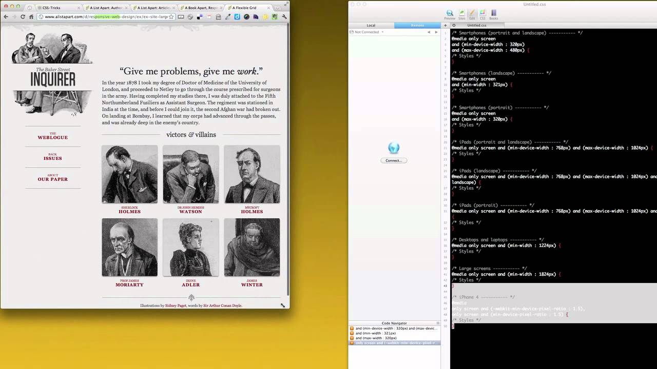
CSS3 Media Queries
Media Types are something that most of us are already comfortable with. We use Media Types all the time to call Screen and Print style sheets. CSS3 Media Queries are a little different, these are used to call conditions of media features. We can call things like “orientation”, “device-aspect-ratio”, “min-device-width”, and many others to accomplish our goals. CSS3 Media Queries give us a lot of freedom to style for present and future devices as web browsers change with time.
We see that “max-device-width” is being used a lot to define devices and state styles for their sizes. This is an easy way to define a device’s browser dimensions and then style appropriately. iPad, iPhone, and even their orientations are stated and styled via the CSS3 Media Queries.
Responsive Web Design
Let’s go back to Ethan Marcotte’s article and look at his example page. Try resizing his example page and you will see the design changes automatically to best fit the browser window. Some of Ethan’s code is sized by percentages; the formula for calculating your desired percentage DIV size is simple. If you start your design at a base of 960px, then 960px will be 100% of the width. Say you want the base width of your footer DIV to be 633px, well you divide 633px by 960px giving you a width of 0.659375. Just take the decimal point and move it two spaces to get your percentage, so the width of 0.659375 is really 65.9375%.
Let’s now look at the CSS3 Media Queries in his example. He has a max-width: 600px, 400px, and a min-width: 1300px. The max-width property sets the maximum width of the elements, min-width property sets the minimum width of the elements. We can see that once we fall below 600px, the columns stop floating and become one column to better accommodate smaller screen sizes.
Ethan is also using max and min-widths to state different sizes for other DIVs, then controlling those sizes by percentages as the user sizes the browser. The percentage technique is not just for users who resize their browser, but more importantly, to respond to different browser sizes in different devices. So Ethan’s example is adapting to set browser sizes of 1300px, 600px, and 400px. Ethan’s example is also responding to any changes in those browser sizes via percentages, thus making his example future-proof up to 1300px.
Mobile Web Design
A good combination of Adaptive and Responsive web design makes a healthy website. Device browser sizes can and will change over time; therefore, using percentages frees us from declaring a new CSS3 Media Query every time a new priority browser size is declared.
The genesis of these new concepts may have been Mobile Web Design; the iPhone was really the beginning of easy mobile web browsing. From this point on who knows what’s next, but we will be ready thanks to Responsive Web Design techniques.