10 Most Common Web Design Mistakes
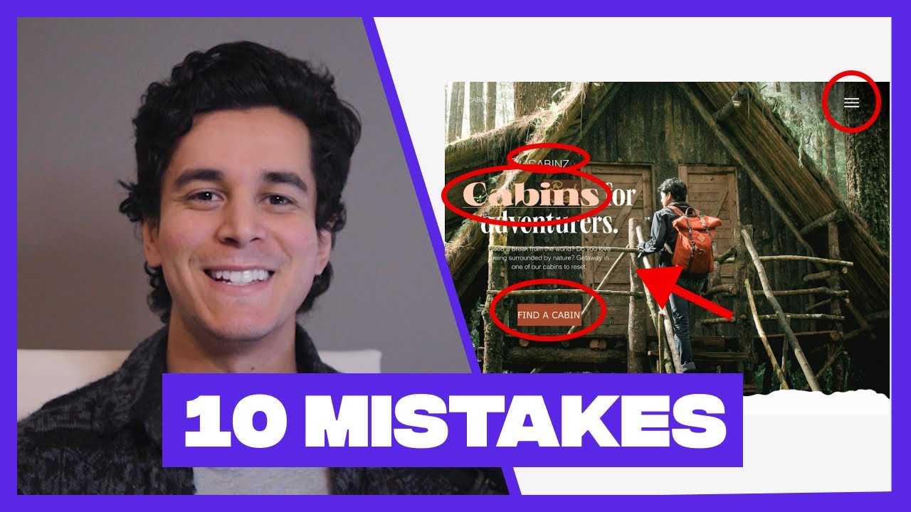
Our #30DaysOfWebDesign challenge is STILL going strong on Instagram! Check what people are creating here: https://www.instagram.com/explore/tags/30daysofwebdesign/ Timestamps: 00:00 Intro 1:00 Text on image not readable 1:20 Left-positioned center-aligned text 1:44 Lack of button padding 2:09 Ungrouped CTA button 2:30 Mobile design on big screen 3:08 Repeating logo 3:24 Overemphasizing text


