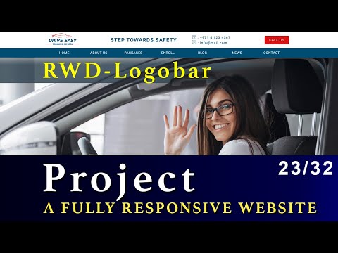
CSS Flexbox Project – Drive Easy
==========================
We’ll build a complete website landing page using CSS Flexbox. The project includes the following sections.
– Logobar
– Navbar
– Hero Image
– Easy Enrollment
– What makes us different
– Key Numbers
– #1 Choice
– Packages
– Contact Us Form
– Footer
– Responsive Web Design for all screen sizes
CSS Flexbox
===========
Flexbox is one-dimensional layout method for arranging items in rows or columns. Items flex / expand to fill additional space or shrink to fit into smaller spaces.
CSS floats and positioning had been the only reliable cross-browser compatible tool for creating CSS layouts for a very long time. These work but in someway they have limitations and are frustrating sometimes.
Flexbox really gives you solution for implementing CSS layouts really quickly and with great power and it takes away lot of CSS float limitations and frustrations.
CSS – Cascading Style Sheets
========================
CSS – Cascading Style Sheets is a stylesheet language used to describe the presentation of a document written in HTML or XML. CSS describes how elements should be rendered on screen, on paper, in speech or on other media.
CSS is among the core languages of the open web and is standardized across web browsers according to W3C specifications. Previously development of various parts of CSS specification was done synchronoulsy, which allowed versioning of the latest recommendations. You might have heard about CSS1, CSS2, CSS3. However, CSS4 has never come an official version.
For CSS3, the scope of the specification increased significantly and the progress on different CSS modules started to differ so much, that it became more effective to develop and release recommendations separately per module. Instead of versioning the CSS specification, W3C now periodically takes a snapshot of the latest stable state of the CSS specification.
In this section, we’ll learn all about CSS, its various properties, CSS layouts including CSS Float Layouts, CSS Flex Box, CSS Grid and Responsive Web Design with the help of media queries.
RWD – Responsive Web Design
=========================
Responsive web design (RWD) is a web development approach that creates dynamic changes to the appearance of a website, depending on the screen size and orientation of the device being used to view it.
In the web design early days, pages were built to target a particular screen size. If the user had a larger or smaller screen, results ranged from unwanted scrollbars to overly long line lengths, and poor use of space.
As more diverse screen sizes became available, the concept of responsive web design (RWD) appeared, a set of practices that allows web pages to alter their layout and appearance to suit different screen widths, resolutions, etc. It is an idea that changed the way we design for a multi-device web.
