Exploring a new web design trend that’s taking over the creative space!
☝️ Watch next:
4 Reasons NOT to become a designer: https://youtu.be/iYegAhaqS0s
How We Work on Real Client projects: https://youtu.be/gRqHEjATSCE
Reasons FOR becoming a designer: https://youtu.be/NVCUfYW62IA
⭐️ Learn with me
My books and courses: https://hype4.academy
My Twitter: https://twitter.com/michalmalewicz
🔮 About this video:
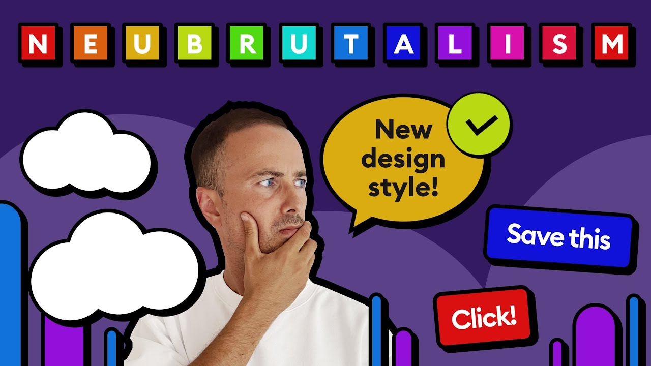
Since the material design revolution, we have been stuck with various versions of the modern-minimal style. Nice, rounded edges on everything, soft, colorful shadows and subtle, pretty gradients. But the fact that Neubrutalism exists makes me happy, because we do need alternatives in UX design.
Neo brutalism is also quite democratic. It often uses shapes styled in a default presentation software way like Keynote or Powerpoint.
That way of styling normalizes the ugly and makes it easier to approach for beginners – they’d be thinking “I could do that myself!” and I believe this is the exact reasons some brands went with this style. It’s non threatening and anyone could do it. As far as UX/UI design trends go, this one is really interesting and worth exploring next to Neumorphism, Glassmorphism, Aurora UI and Modern Minimal.
You can find out more about this trend at neubrutalism.com
We talk about this style based on great examples from @Figma and @Gumroad
👨🏻💻 About me
I’m a designer, entrepreneur and startup founder. I started back in the late 90’s and currently my main goal is to share my knowledge, both paid and free. This channel is one of the places where I share my tips on design, user experience, growth, marketing, life and mindfulness. Subscribe to stay in touch. ❤️
#neubrutalism #neobrutalism #ux
00:00 – Intro
00:20 – Design Styles
01:05 – King of UI
01:46 – Brutalism
02:09 – Contrast
03:00 – Shadows
03:24 – Ugly on purpose
04:29 – Typography
05:54 – Illustration
06:55 – Animation
07:36 – Gumroad
08:05 – What’s next?
