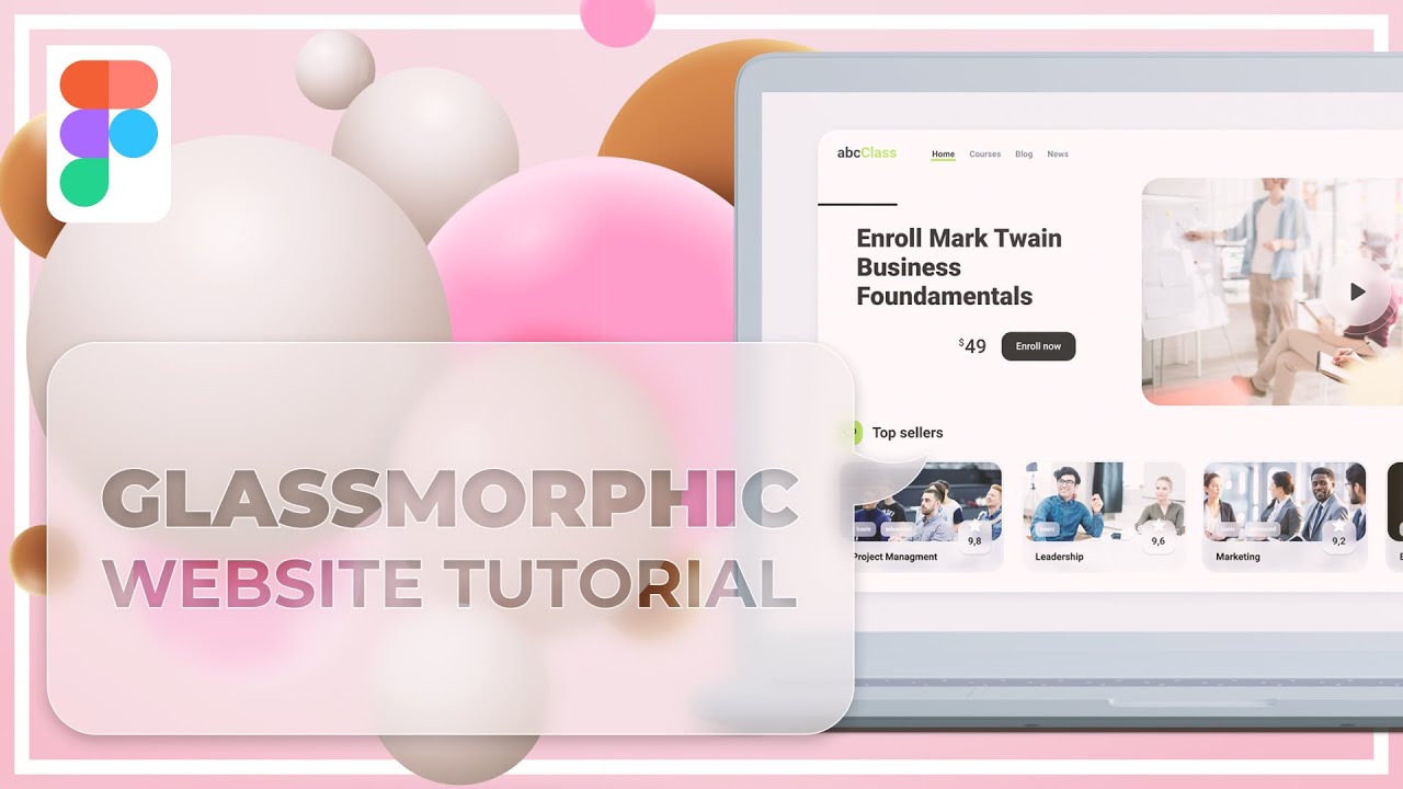
In today’s Figma UI Design Tutorial I will show you how to design this awesome glassmorphism website snippet. My primary reason for it is that typically if you look for glassmorphism figma tutorial examples either here at YouTube or for inspiration at Dribbble or Google, most of the time you will find how to design glass credit cards. Don’t get me wrong, a glass credit card is a totally valid example, but glassmorphism is much more than that and it’s also hard for you to stand out if everyone designs the same thing.
Chapters:
00:00 Intro
00:46 Essential items
01:22 Let’s go
01:34 12 column layout
01:57 Website background
02:23 Making “logo”
02:36 Adding navigation
03:05 Icons
03:20 Hero header
03:28 Adjustments to the layout
04:06 Filling header with photo
04:20 Header title
04:36 Glass header title background
06:14 Glass play button
06:41 Icon adjustments
07:01 How to copy layer style
07:15 Glass style adjustments
08:20 More layout adjustments
09:16 Glass cards
11:00 Glass pills
11:40 Indicator
12:08 More details
13:14 Outro and Summary
You can preview Figma file presented in the video here: https://www.figma.com/file/wThp0mh7eeFJp9nL9tzH7q/Figma-tutorial-3?node-id=0%3A1
Watch more Figma tutorials here: https://youtube.com/playlist?list=PLtZjSN7j6ANwYc2jAkdAz4HWndJNGLjVK
#glassmorphism #figma #tutorial #designtutorial #Figma #designtrends #UIDesign #figmatutorial #UITutorial
