Get the course today https://www.udemy.com/course/responsive-website-template-from-scratch-html-css/?couponCode=UPDATE2022
Modern Responsive Web Design Source Code CSS and HTML CSS Grid Design website
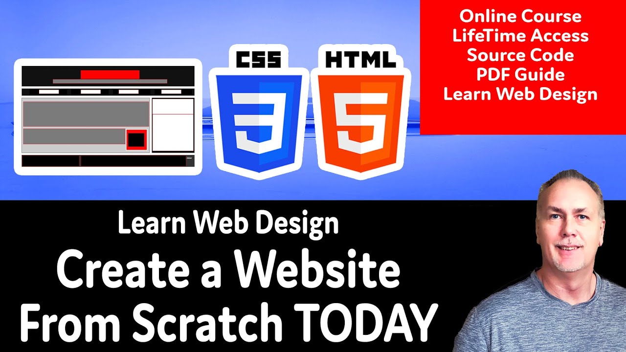
Explore how you can create a website, apply CSS to HTML page elements for modern real world website design. Create a basic HTML CSS website template that you can use as a base structure for creating more websites. Setup the HTML page elements, including the header footer and main content area. Add a navigation bar and side menu. The upcoming lessons will help you learn to apply CSS to HTML elements. HTML and CSS are prerequisites as this course is designed to demonstrate applying and practicing CSS skills.
Learn how to create a website from scratch.
HTML CSS Grid Template Setup
CSS NavBar with CSS Grid
Web Design Content
Media Query Final Updates
HTML CSS Grid Template Setup for the basic page structure
Plan a basic HTML structure using the semantic tags. Link to a stylesheet and apply display grid to the parent element. display: grid; Setup the row heights within the grid-template-rows Set the columns for the main and aside within the grid-template-columns Set a start and end grid column for the elements that go across the entire full width. grid-column-start: 1; grid-column-end: 3;
How to add a responsive CSS NavBar using CSS Grid styling blocks
How to set up a navigation bar using CSS Grid. Apply and set the display to the grid of the parent element. Set the column template to create separate columns for each navigation bar item. Update the list items, remove the default styling of the unordered list items, to create navbar blocks. Add hover effect for the mouse over highlight of the nav bar item blocks.
Adding Placeholder content and Web Design styling with CSS
When creating web pages, often the final content is not ready. You can use placeholder content, like images and lorem ipsum text in place of content which can get added later. The placeholder or dummy content can be used while designing your website so that the pages have a real look and feel to them. This is perfect for web design and testing of responsive and positioning of page elements with CSS. Apply CSS styling and make adjustments to fit the content as desired. This lesson will apply styling to the page elements, including the header with titles and slogan. The main content area and adding images that appear as a thumbnail type style. Setting the aside content to separate as content blocks. Creating a two column footer using CSS grid styling.
CSS setting Media Query with Final CSS style Updates
Resize and stack columns as rows on screen sizes less than 640px. Add the media query and make adjustments to the look and feel of the website on smaller screens. Test out the styling and preview how it adjusts to different size screens. Use the placeholder content to simulate real website content to be added afterwards.
Course content web development and web design courses with coding examples and source code for the lesson content. Source Code is available within my Github account. Lessons posted are designed to help students learn more about a specific topic related to modern web development and applying code.
Laurence Svekis is a professional top selling course author having instructed over 1 Million students both online and in person. Laurence Svekis is a Google Developer Expert specializing in Google Workspace automation using Google Apps Script Code.
Check out my Website for more details at https://basescripts.com/
