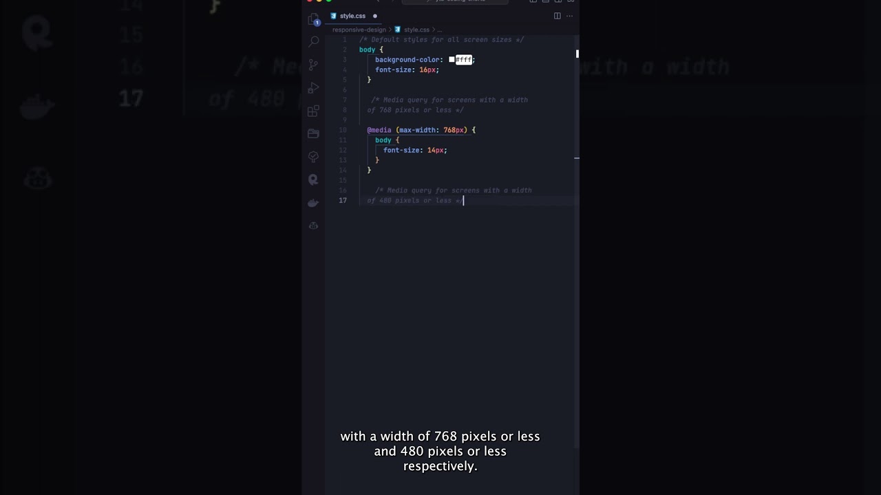
Learn how to make your website look great and work seamlessly on any device with responsive web design. In this video, we’ll show you how to use CSS media queries to adjust your website’s design based on the user’s screen size. With these tips, you’ll be able to create a user-friendly experience that looks great on smartphones, tablets, laptops, and desktops.