Visit my STORE: https://bit.ly/mavi-design-store
Explore Mavi Design PREMIUM Assets: https://bit.ly/mavi-design-premium-assets
Download FIGMA for FREE: https://bit.ly/get-started-with-figma
Take FULL advantage of ALL FIGMA’s features: https://bit.ly/figma-professional-plan
FREE FIGMA COURSE / SERIES: Design a Website in Figma: https://youtube.com/playlist?list=PLCUPtxXqnWn0AMIjZmNdkrzWVjLHOW2NT
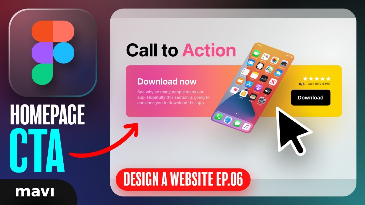
In the sixth episode of “Designing a Website in Figma”, we’re going to create a Call-to-action / download now section of our website. The call to action (CTA) element is a very important part of any website, because it is a specific place where you’re trying to make a conversion happen (download, signup, click through..). Conversions are usually the #1 reason a website exists in the first place, which means that understanding CTA elements, sections and buttons is key to understanding the overall function of a website.
How to design a “download now” call to action element / section for a website in figma – step-by-step explanation tutorial with examples – design a website from scratch in Figma – FREE full course
————————
© 2023 Mavi Design
