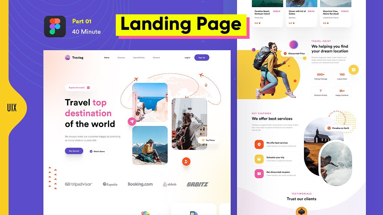
Dear Friends, In this Figma Masterclass I’m going to show you how to create responsive web design in figma. I’ll design travel website home page Part 1 for Desktop & convert it into responsive mobile version in Part 2. In this Speed UI Design figma tutorial you’ll learn figma responsive web design for a landing page using figma Auto layout to make the page ui ux design mobile friendly so it work fine on desktop, tablet & mobile & this is the best tutorial for the figma users who struggle how to covert desktop design(responsive) into mobile.
In this UI Design tutorial im using 12 columns layout with 8×8 grid system to make the landing page design properly aligned with spacing, padding & margins in every single item to look consistent. I’m figma plugins to make the process easy with help of these plugins Unsplash, Freepik, Pexels, Beautiful shadows, Type scales, Batch styler, Vector logos, UI faces, Colour hunt.
Please drop your suggestions & feedback about this tutorial and I would be very happy if you decided to subscribe, like & share. Thank you
– For mobile responsive version please watch this tutorial part 2.
#responsive #webdesign #ui #website
===========
Please Subscribe to the UIX UNIVERSITY YT Channel:
https://www.youtube.com/c/UIXUniversity
===========
Let’s CONNECT on social media and say Hi!!
UIX Facebook: @uixdesign.me
UIX Instagram: @uixdesign.me
UIX Twitter: @uixdesign_uiux
UIX TikTok: @uixdesign
UIX Dribbble: @uixdesign
===========
Source File:
https://www.figma.com/community/file/1243486162245593034