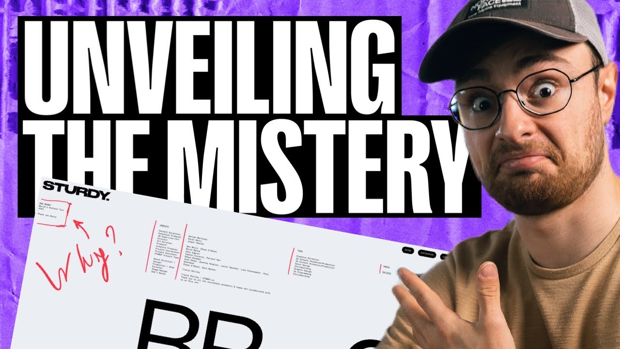
Finally, after two really long and busy months, I am back to you friends With your most requested video about asymmetry in Web Design! Today we are going to brake down two of the best Websites that you can find right now on the web, we are going to see the strengths in their layouts and why the Designers made certain choices in their asymmetrical compostions!
Let me know in the comments below your thoughts, if the video was helpful and if you would like to see more content about this topic!
WHERE CAN YOU FIND ME ↓↓↓
INSTAGRAM – https://www.instagram.com/mv_studiodesign/
TIKTOK – https://www.tiktok.com/@mv_studiodesign
Facebook – https://www.facebook.com/matteovalentinodesign/
WEBSITE – https://tmvdesignstudio.com
MUSIC FROM: https://www.epidemicsound.com/
