Figma has been a staple of my web design workflow for years. Before Figma, it was Adobe XD. Of course, I’m also guilty of “designing in the builder” in years past.
Let me clarify, though. When I say “my web design workflow,” I don’t mean that I’m actually the one doing the designing. I admitted to myself years ago that I’m not a real designer. I can “get by,” but I’m not a legit designer. Thus, I hand off the design portion of our client projects to people who know what they’re doing.
See, design and development are two VERY DIFFERENT disciplines. Most great designers don’t know how to do development, and most great developers aren’t good at design.
I think our industry would be WAY better off if more developers/assemblers admitted to themselves and their clients that they’re not designers and then hired real designers to lead the design phase of their projects.
That’s the first big step in separating design and development in your workflow (and professionalizing your process).
The second big step is to separate where the work gets done. Page builders, and design tools like Figma, are radically different work environments. Design tools empower designers to do their best work. Page builders do not.
When creative work is done in page builders, things get inefficient and messy. A lot of people will try to say this isn’t the case. They’ll argue that it’s more efficient to design in page builders. But, the cold hard truth is that 95% of these people aren’t designers – they’re developers who are desperately trying to cling to their role as the “I can do it all” person.
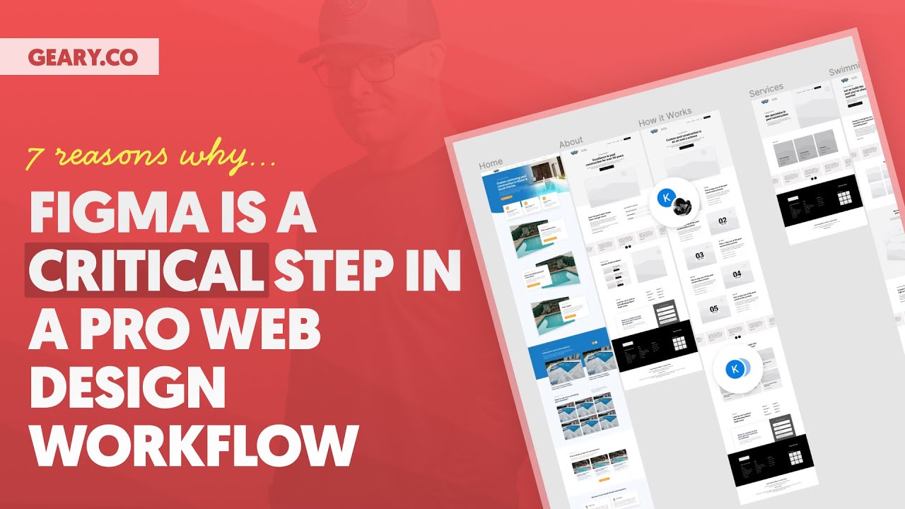
At the end of the day, this isn’t a question of preference. The answer isn’t purely subjective. There are some undeniable reasons why UX and UI design should be done in a design tool rather than a development environment, and I’m going to give you seven of them in this video.
Watch the video, digest the seven reasons, and then consider adding Figma to your workflow if you haven’t already. With Frames for Figma and ACSS Tokens right around the corner (https://getframes.io/figma), UX Design, Wireframes, Prototypes, and high-fidelity UI design have never been easier or more efficient.
Make sure you’re on the waiting list for Frames for Figma: https://getframes.io/figma
*** MY TOOLS ***
🔥 AutomaticCSS (ACSS) – https://automaticcss.com
🔥 Frames – https://getframes.io
See all my recommended tools here: https://geary.co/tools/
*** INNER CIRCLE ***
Step your design/dev game up, make more money, and get the full scoop on scaling your digital agency! When it comes to the Inner Circle, I don’t hold back.
⭕ In-depth design & dev trainings
⭕ Business, sales, & marketing trainings
⭕ Agency resources & downloadables
⭕ Vibrant, quality community with zero toxicity
⭕ …and much more!
Learn more and join here: https://geary.co/inner-circle/
*** SOCIAL ***
👉 FB – https://www.facebook.com/marketingkev/
👉 LinkedIn – https://www.linkedin.com/in/kevingeary/
*** CHAPTERS ***
