✅ Want these designs? https://nicolaipalmkvist.com
Why do some websites instantly look expensive, modern, and professional, while others feel flat no matter how much time you spend on layouts and tweaks?
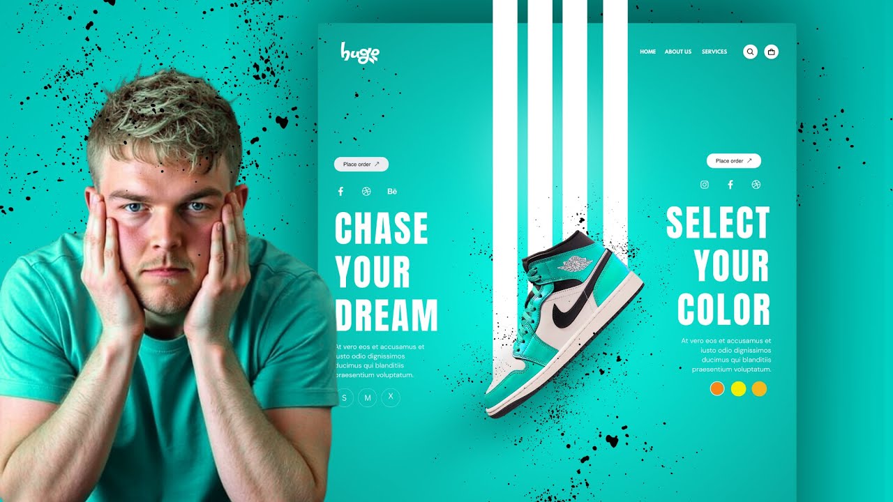
In this video, I break down the real secret behind beautiful web design in 2026 and it’s not what most people think. It’s not about complex layouts, advanced conversion tricks, or overdesigned sections. In fact, it’s almost stupidly simple.
Instead of telling you the answer upfront, I’ll show you. You’ll see the exact same website designs with one crucial element changed and how everything suddenly falls apart. Flat. Cheap. Wrong. And once you see it, you can’t unsee it.
This is a practical web design tutorial for Elementor and WordPress users who want their websites to look more professional without overthinking the process. We’ll walk through a real, step by step workflow where I start from a blank page, choose the right visual direction first, and build the entire website around that decision.
You’ll learn why most designers get web design wrong in 2026, why images matter more than layouts, how to place images correctly, how to keep a consistent visual thread across a website, and why removing a single image can reveal that there was almost no design there at all.
This video is perfect if you’re working with Elementor, building WordPress websites, or simply want modern web design tips that actually move the needle. Everything shown works for real websites in 2026 and beyond.
By the end, you’ll understand the one trick that almost every beautiful website uses and how you can apply it to your own projects right away.
Other Links:
✅ Get Elementor Pro: https://lifeonablock.com/elementor
✅ Free stock images: https://www.lummi.ai
✅ Screen recorder software: https://lifeonablock.com/screencast