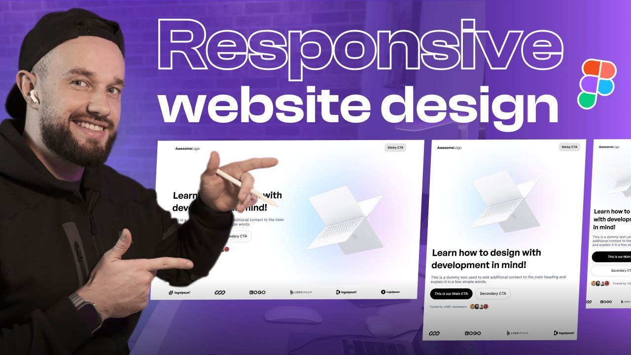
Learn how to create 100% responsive web designs in Figma, using Auto Layout ONLY, without Plugins or Constraints. Enjoy!
If you’re ready to learn more – check out the Figma Mastery course👇
https://howtodesignbetter.com/figma-mastery
Timestamps:
00:00 – Intro
00:30 – Getting started
01:51 – Fixing Header, Hero, and Logos
05:56 – Tablet designs
08:09 – Mobile designs
11:46 – Why Auto Layout is important
12:27 – Figma to Framer? Leave a comment!
12:48 – Outro (Figma Mastery)
———————————————-
P.S. If you’re interested in learning UI/UX design feel free to check out my design ebooks – there are free samples available (110+ pages total).
For mobile designers 👇
https://uiadrian.gumroad.com/l/design-manual
For website designers & freelancers 👇
https://uiadrian.gumroad.com/l/web-design-guide
———————————————-
Watch the previous tutorial about box model if you haven’t yet! ➡️ https://youtube.com/watch?v=aYRoHooj0hg
This will help you get a better idea about designing for development in Figma
———————————————-
Connect with me 👋
Instagram – https://instagram.com/uiadrian
Twitter – https://twitter.com/uiuxadrian
Linkedin – https://linkedin.com/in/adrian-kuleszo/
Thanks for dropping by my channel – if you enjoy what you see, feel free to subscribe and hit that bell notification, and I promise to bring you a ton of free value every week!
