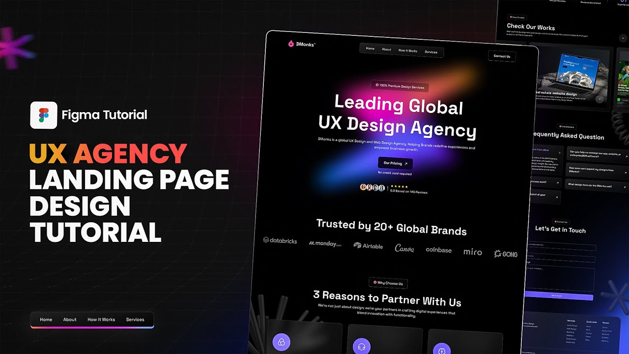
In today’s tutorial,
we’ll walk you through designing a UX Design agency landing page in Figma from start to finish!
Whether you’re new to web design or looking to refine your skills, this step-by-step guide will help you craft a stunning, high-converting landing page that aligns with your agency’s goals.
What You’ll Learn:
✔️ Structuring an agency landing page to capture attention and engage visitors
✔️ Selecting a color scheme that reflects your agency’s brand identity
✔️ Using Figma’s tools to create responsive, well-aligned layouts
✔️ Adding interactive elements to make your design stand out
✔️ Building a mobile-friendly version to ensure accessibility on all devices
Follow along to gain insights and practical tips that will set your designs apart and make a lasting impact!
About Design Monks:
Design Monks is a UI/UX design agency with a passion for crafting tailored, user-focused designs. With over 3 years of expertise and a team of 25+ skilled designers, we deliver standout design solutions across various industries, empowering brands to achieve their goals with precision and creativity.
Thanks for watching this video. It will mean the world to us if you subscribe to our channel, like this video, comment on what’s your impression about it and share.
———————————————————————————
💡 Got any UX-related project?
👉 Book a call with us: https://tidycal.com/designmonks/lets-discuss
You can find me:
🌎 Website: https://www.designmonks.co
🔗 Facebook Page: https://www.facebook.com/designmonks.co
🏀 Dribbble: https://dribbble.com/design_monks
🔗 LinkedIn: https://www.linkedin.com/company/designmonks
———————————————————————————
For business and other inquiries: hello@designmonks.co
