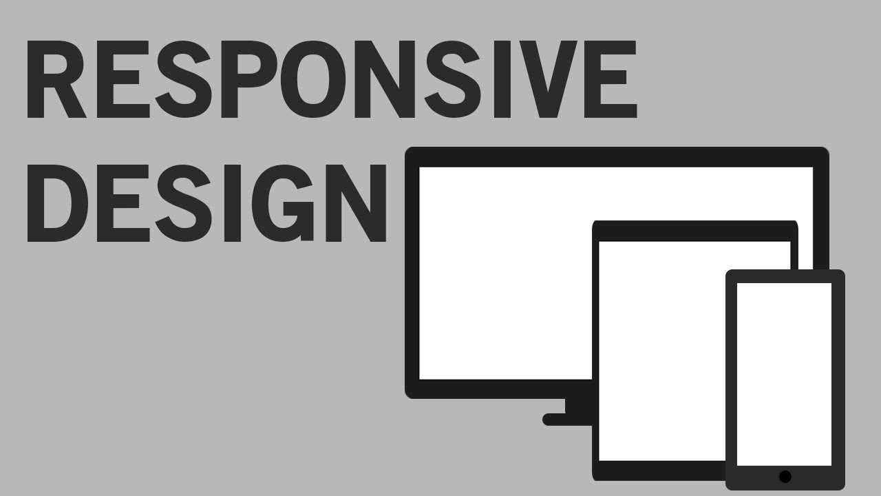
In this tutorial I show you how to use media queries to make your website responsive and work across multiple devices and screen widths.
The code is on Patreon:
https://www.patreon.com/posts/5546050/
.
Follow me on Facebook:
www.facebook.com/quentin.watt
Follow me on Twitter:
www.twitter.com/QuentinWatt
Don’t forget to subscribe:
www.youtube.com/QuentinWatt
Donate on PayPal:
https://www.paypal.com/cgi-bin/webscr?cmd=_s-
xclick&hosted_button_id=DM496T7CTUYAS Donate on PayPal:
https://www.paypal.com/cgi-bin/webscr?cmd=_s-xclick&hosted_button_id=DM496T7CTUYAS