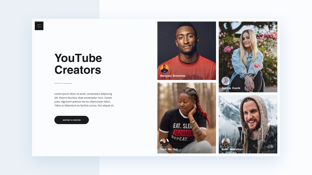
Learn how to create a responsive landing page from scratch with HTML, CSS, and JavaScript. You’ll cover some basics of HTML and CSS as well as more advanced CSS topics. Last, you’ll create a toggle menu with a custom JavaScript function and add responsiveness with CSS media queries.
👀 LIVE DEMO 👀
https://masonry-landing-page.netlify.com/
🗂 DOWNLOADS 🗂
https://www.skillthrive.com/courses/masonry-landing-page
⏰ TIMESTAMPS ⏰
Import Fonts and Images into Project: 1:15
Import Google Font: 5:14
HTML for Hamburger and Nav: 6:12
HTML for the Home Header: 8:49
Install Live Server: 11:04
HTML for the Cards: 12:17
Import JavaScript File in HTML Body: 15:30
Import Font Face into CSS File: 16:22
CSS for Root Elements and CSS Resets: 17:09
REM Overview: 18:07
CSS for Home Info Section: 20:50
CSS for Line Break Span Element: 25:03
CSS for Card Section: 33:05
Create and Get CSS Code for Gradients Using Figma: 40:17
CSS Aspect Ratio: 42:56
CSS for Hamburger and Menu: 45:10
JavaScript for Menu Animation: 59:22
Responsive Design with CSS Media Queries: 1:03:51
🔗 HELPFUL RESOURCES 🔗
VSCode: https://code.visualstudio.com/
Figma: https://www.figma.com/
ImageOptim: https://imageoptim.com/mac
Google Fonts: https://fonts.google.com/
Live Server: https://marketplace.visualstudio.com/items?itemName=ritwickdey.LiveServer
Firefox Developer Edition: https://www.mozilla.org/en-US/firefox/developer/
👋 FOLLOW US 👋
Instagram: https://instagram.com/skillthrive/
#HTML #CSS #LearnToCode