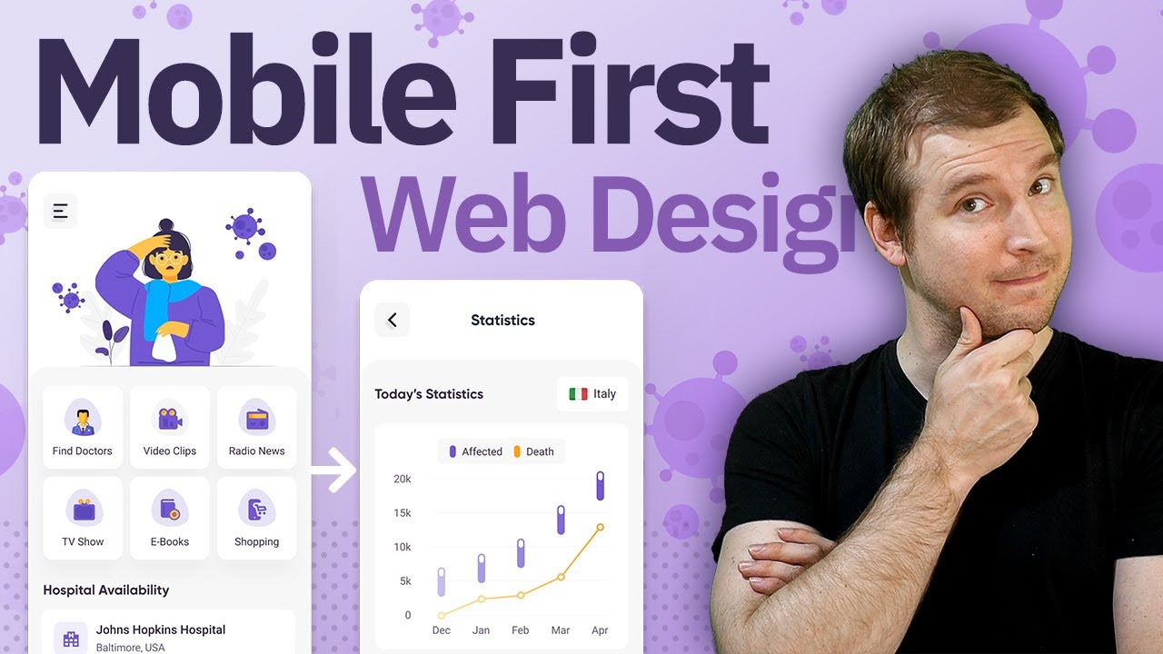
Mobile First Web Design Tutorial.
In this example, we develop a website using mobile first strategy and take a look and creating this cool UI design by Hachibur Rahman. We used HTML and CSS to create the mobile website design by creating a baseline phone outline, and using flexbox to create and import all the elements over from Figma.
Website designs are often done for the desktop first, but these days more people use mobile web apps and sites. I thought it would be useful to show what the development of web design for mobile-first would look like. It can feel a little backwards, as the next stage would be to have media queries for responsive design going back to the desktop, and this is something we might check out in another video.
I hope this gave you a good idea of what the mobile design first website development can look like.
This video is part of @Florin Pop #7Days7Websites challenge. This is Day 2. You can learn more on his recent post on dev.to:
https://dev.to/florinpop17/the-7days7websites-coding-challenge-3o3g
#mobilefirst #webdesign #adriantwarog
Hachibur Rahman:
https://dribbble.com/Hachib
Follow and support me:
🐦 Twitter: https://twitter.com/twarogadrian
💬 Discord: https://discord.gg/nGdThpE
💸 Patreon: https://www.patreon.com/adriantwarog
🖥️ Dev.to: https://dev.to/adriantwarog
