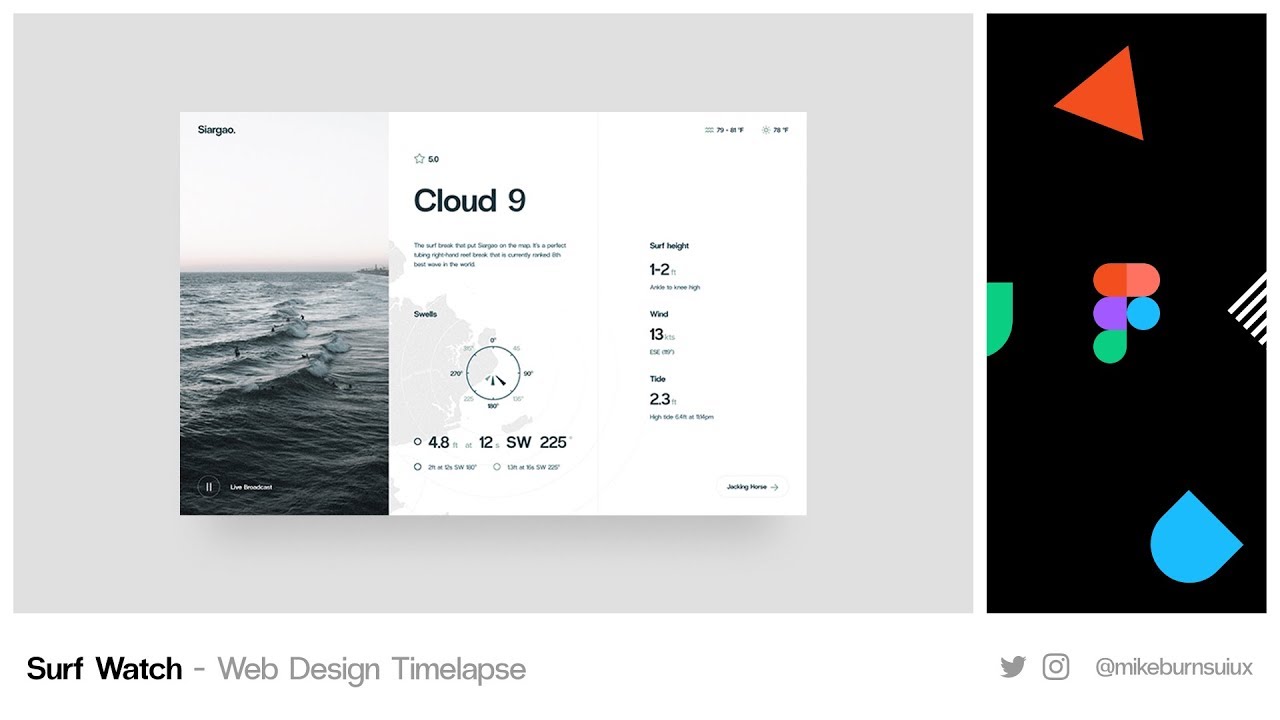
Surf Watch is just a simple website telling you where to go or when. You can accurately make the call wherever you choose to surf.
Tutorial: https://mikebrns.com/blog/surf-watch-figma/
–
Assets:
https://www.dropbox.com/sh/f1ng046qf05b9j6/AAClAP759T62JYYGhEtP0YnPa?dl=0
Golden Canon Grid:
https://gumroad.com/l/goldencanongrid
–
In this Figma tutorial time lapse, we’ll use a few stock photos to make the design more lively. We’ll cover using grid layout, 8px baseline grid, type scaling, shared styles, and more! Enjoy!
00:15 Header
00:52 Left Sidebar
01:30 Button
02:10 Icons
03:45 Content
08:50 Radar
13:35 Shared Style (Color)
16:30 Adding Image
–
Twitter: https://twitter.com/mikeburnsuiux
Instagram: https://www.instagram.com/mikeburnsuiux/
mikeburnsuiux is a YouTube channel dedicated to creating the best Figma, Webflow tutorials. My goal is to create the best, most informative, and short and sweet tutorial. If you enjoy my videos, the best way to support what I do here is to simply subscribe to the YouTube channel by pressing the red button.
✉️ business inquiries: hello@mikebrns.com
–
