In this quick tutorial, I’ll show you how to use a simple free plugin, in order to simulate your design responsiveness inside Figma! No need to wait for code to try and see how your design looks when used on different screens.
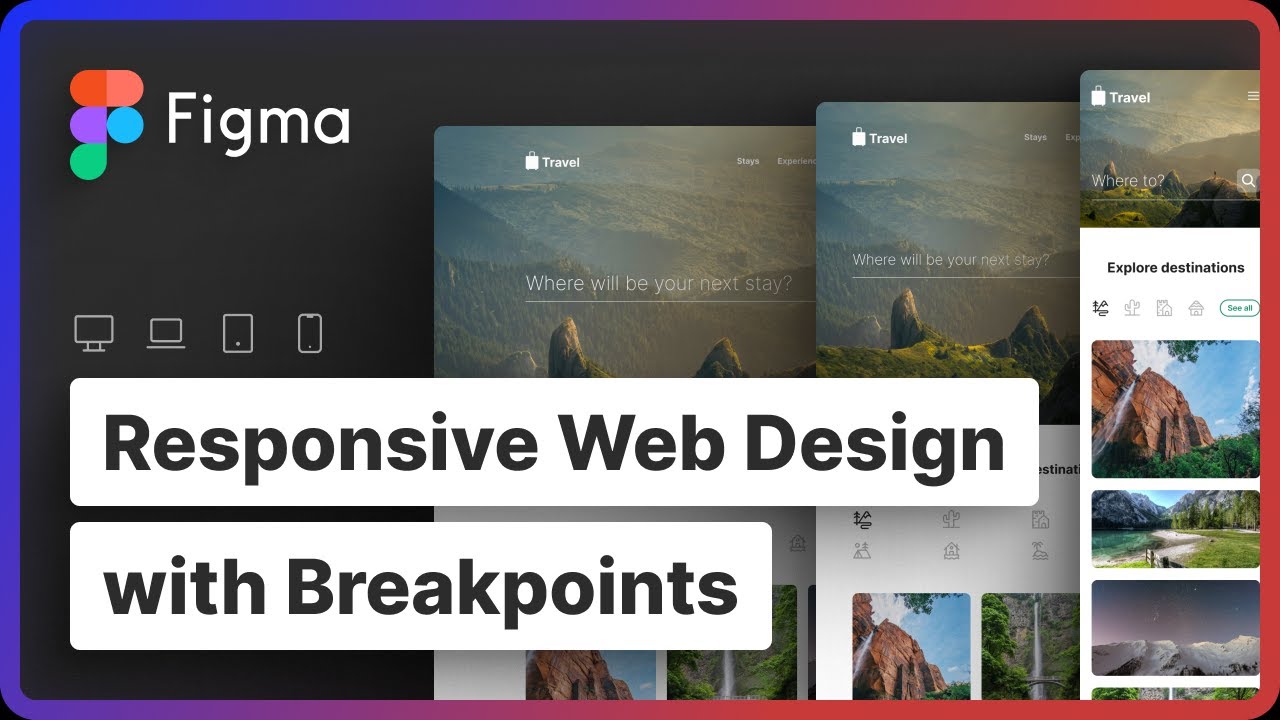
Download the plugin from Figma Community and start creating responsive designs inside Figma!
0:00 Intro
0:19 What’s a Breakpoint?
0:52 Figma Walkthrough
1:20 Use Responsive plugin
2:00 Outro
Remember Like and Subscribe! http://bit.ly/sub-fz
Music:
♪ Dream (Prod. Riddiman)
Link : https://youtu.be/ibL-r_-hffc
_________________________________
✉️ Contact me ▶︎ http://bit.ly/fzcontact
📺 Subscribe ▶︎ http://bit.ly/sub-fz
_________________________________
Follow me on Social 👇🏻
Portfolio ▶︎ https://fatehzid.com
Dribbble ▶︎ https://dribbble.com/FatehZid
Instagram ▶︎ https://www.instagram.com/FatehZid
Facebook ▶︎ http://fb.me/fatehzid.artdirector
LinkedIn ▶︎ https://www.linkedin.com/in/fatehzid/
Twitter ▶︎ https://twitter.com/FatehZid
Behance ▶︎ https://www.behance.net/fatehzid
_________________________________
Thanks for watching! See you next time!
© 2022 Fateh Zid | 🧔🏻fatehzid.com