Categories : Web Design
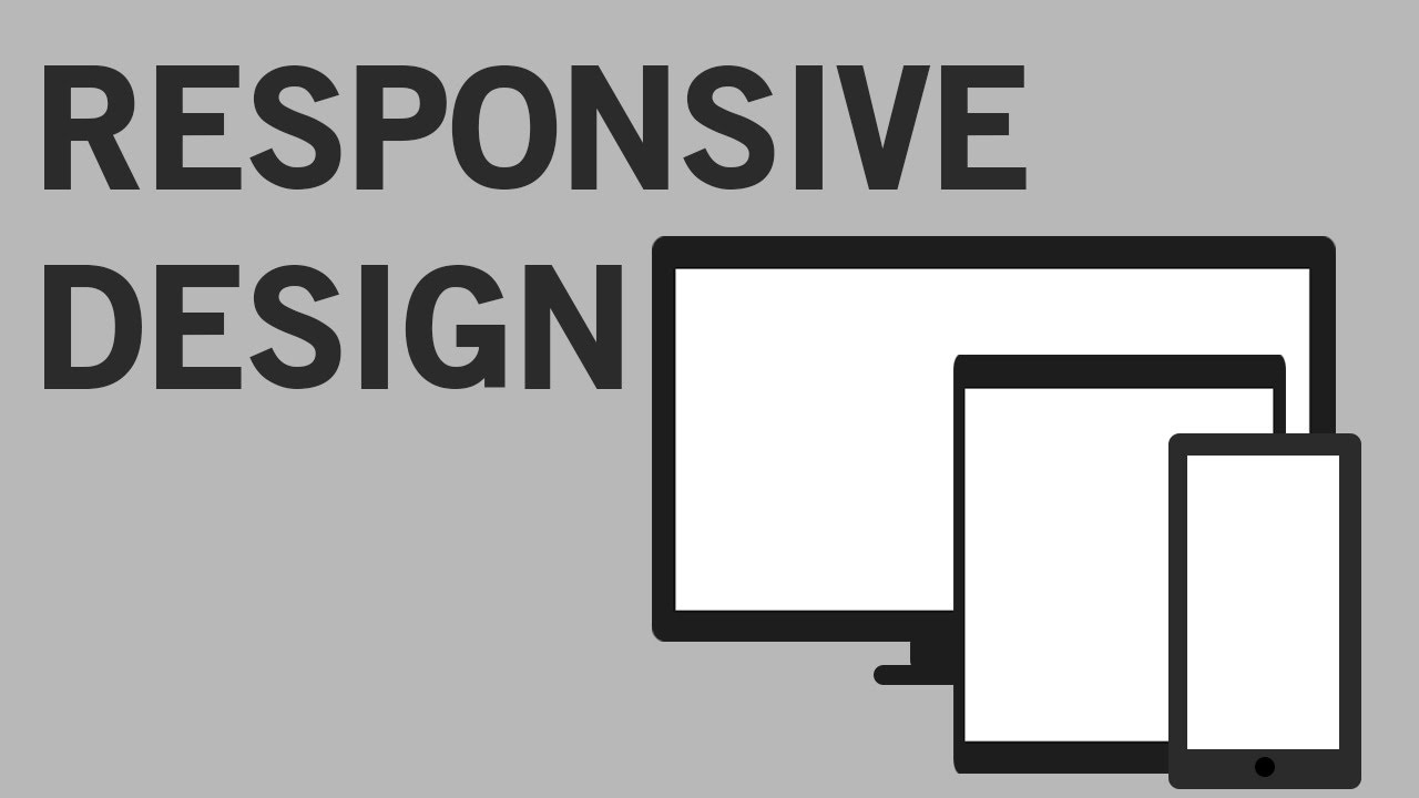
HTML5 and CSS3 Responsive design with media queries
In this tutorial I show you how to use media queries to make your website responsive and work across multiple devices and screen widths. The code is on Patreon: https://www.patreon.com/posts/5546050/ . Follow me on Facebook: www.facebook.com/quentin.watt Follow me on Twitter: www.twitter.com/QuentinWatt Don’t forget to subscribe: www.youtube.com/QuentinWatt Donate on PayPal: https://www.paypal.com/cgi-bin/webscr?cmd=_s-