
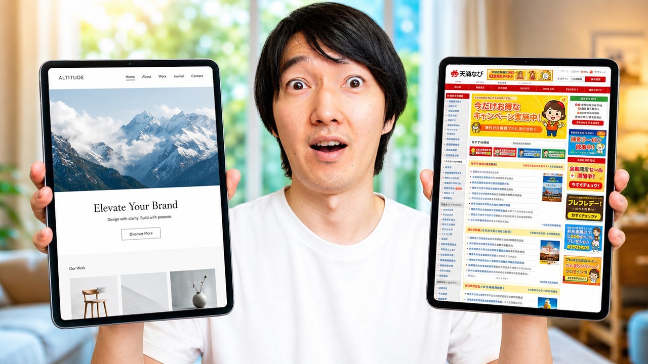
This video explores the stark contrast between Japanese Design and its Western counterparts. If you have ever compared these styles, you likely noticed that while English designs favor simplicity and a single clear message, Japanese creators often opt for text-heavy, complex layouts. We examine whether these visual design choices stem from different aesthetic values or something deeper.
👉 *Subscribe here* → https://www.youtube.com/c/JapanwithNao
–––––––––––––––––––––––––––––––––
📌 *Watch Next*
→ https://youtu.be/_3sAOEHvgq8
→ https://youtu.be/dCl77oKzn5w
–––––––––––––––––––––––––––––––––
🎁 *Support the Channel*
Join my Patreon for exclusive behind-the-scenes content & more:
→ [https://www.youtube.com/c/JapanwithNao/join]
→ [https://www.patreon.com/japan_with_nao]
–––––––––––––––––––––––––––––––––
🌏 *About This Channel*
On this channel, I share insights into everyday life, hidden culture, and untold stories from Japan.
🧑💻 *About Me*
Hi, I’m Nao. I was born and raised in a Buddhist temple in Japan.
After spending some time overseas, I started this channel to share untold stories, everyday culture, and small moments from real life in Japan.